Artist-tecture

Guggenheim Museum Licenses Colors; Towel Bars and TP Holders Coming In 2012

guggenheim fine paints.jpg
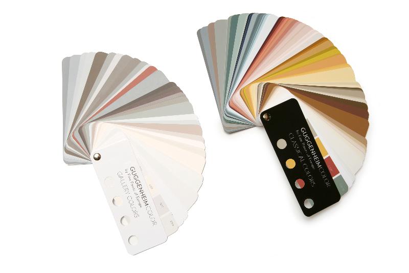
Qualifying for most hilarious licensing deal of the month, The Guggenheim Museum in New York is licensing paint colors.  It's a natural, from a focus group viewpoint.  Think about it.  Museums have both paint-ings and they also paint their walls.  Sometimes in non-white colors!  So they took colors from famous/old paintings to create a fan deck that looks like, well, like most paint fan decks, except with fewer true greens and oranges. 

Guggenheim CLASSICAL colors.jpg
Don't get me wrong, I love me some creative licensing.  Frankly I don't care if it's off-mission or off-brand or off-message or whatever constructions end up limiting original thinking.  But if you're going to go off-road with your product, it should at least rock the party microphone.  These colors are very, very nice!  But are the hues really any different than just picking the same color chips from other fine paint company's existing palettes?  And are the colors really unique to Guggenheim?  If Fine Paints Of Europe (whose paints rock, by the way) did this with a Cezanne in MoMA wouldn't the end result be the same?  The product looks nice, but the branding feels flat. 

My favorite part of the press release: 

For more information about the Guggenheim Museum's licensing program:  www.guggenheim.org/new-york/about/licensing-location-shoots.

Miso, City Of Reubens


misobuffdiss2.jpgWhilst perusing the website for the Living Walls Conference (coming to Atlanta in August!) I was taken particularly by the artist Miso, living in Melbourne, Australia.  An entire section of her site is devoted to street art.  Not necessarily original (any dweller of New York has seen dozens of work like this, living as we do in the graffiti capital of the world), but definitely with a specific grasp of how street art affects how we use and inhabit cities.  Her work unifies a lot of the poster detritus it operates on, and creates a new standard for site-specific street art.

Master's Chair


kartell-welcomeblack1.jpgSometimes referencing three other things all at once in a design is a ridiculous mess (however fabulous the result may be).  Sometimes, it rocks.  Witness Kartell's new Masters Chair, which references silhouettes of famous chairs by Arne Jacobsen, Charles and Ray Eames, and Eero Saarinen.  The resulting chair is some kind of seriously whacked out Thonet No. 14, capturing the lightness and alien spirit of that chair.  In plastic.

If only they'd added Adolf Loos to the mix.

As seen on Cool Hunting.
Advertisement

Support our advertisers because they help keep the content free.

If you're interested in advertising, contact us.

The Ethics Of Dust


ethicsofdust.jpgJorge Otero-Pailos, an architect/artist, is our favorite kind of preservationist.  His bio is all we need to know: "his work rethinks preservation as a powerful countercultural practice that creates alternative futures for our world heritage."

And how.  Our favorite project of his is The Ethics Of Dust, consisting of a large latex sheet that pulled off ancient pollution from the Doge's Palace last year at the Venice Bienale.  Backlit and freefloating, it's like a Shroud of Turin for architects: a study of time, and the value of recording even the decay of an important icon.

Anish Kapoor Does All Towers At Once


KA---POW.pngLike the love child, or a genetically spliced clone of, the DNA of the Eiffel Tower, Tatlin's Tower, and Umschreibung, Anish Kapoor has unveiled his proposal for the London 2012 Olympics: ArcelorMittal Orbit, which seriously makes no sense to me, is that one, two, three corporations mashed together or is that the name of the work?  2012 is the new 2007.

However, the insanity of it almost rescues it.  Perhaps Tower Of Power will perform at the opening ceremony?

Tipped off by Art Lovers at The Awl.

Acido Dorado: Mies Finally Loses Control And Gets Giddy


outside-pool-fence-gold1___2d3401dbab58d49e5c491294aee95f3d.jpgFor those of you who thought Rosa Muerta was pretty sweet (and most of you did, the house got jillions of hits and went on a magazine tour) we would like to direct your attention to the amazing Acido Dorado.  We got wind of this last December, but in our winter business flurry we let it fall to others to announce the awesomeness.  Now we chime in.

Acido Dorado.  It's like Mies is still doing houses, and he's in his late-period expressionist phase, and he's really lost his previous control.  This is a good thing.  He brilliantly does his color-symmetry thing, except this time with the desert, and the color GOLD MIRROR.

Except it's not Mies.  It's Robert Stone, who develops these houses and then rents them out.  The most brilliant strategy for creating new and idiosyncratic buildings in the USA today.  Don't take our word for it, just read the website:

Acido Dorado sits in a 180 degree nook of a small mountain of rocks and presents on the outside a long and low chopped and channeled profile with huge mirrored overhangs, hearts, flowers, and 3 colors of acid-tinged metallic gold. Inside, it's all preppy-glam; a beige and tweed country club strung out on gold and mirror accents.

Denver Art Museum: The Castle And The Bower


Okay let's get this one out of the way: Gio Ponti's Denver Art Museum is not his best building.  It would be nobody's best building.  But it is a very brilliant building, even though it tries a lot of ideas that don't always work.

Works: the basic premise.  Instead of being a classic big, sprawling, flat, three-level supermall of art, like the Metropolitain Museum in New York, Ponti stacked the museum in a seven-story castle-like structure.  Every floor is devoted to one area of specialty, which made it like entering a special realm devoted to that area.  For collections that are not as strong in Eastern Seaboard museums, like American Indian Art, Western American Art, or Spanish Colonial Art, this effect of specialness is pronounced.  What are usually the leftovers in museums with powerful Renaissance Painting collections are here the primary reason to visit.  While the arrangement sacrifices some curatorial connections between periods and cultures by this separation, for this museum and the particular collections it specializes in, it works.

Works, sometimes: the castle idea.  The building looks like a castle, and against the snowy mountains surrounding Denver, the conceit really works.  I personally think it looks cool: it's straight out of Domus 1956.  Not cool is the fact that there is a large concrete fence around most of the museum.  It's not very friendly to many of its street faces.

Works, mostly: the windows.  Because a lot of natural light is not desired, Ponti only cuts the building here and there to let little slivers of views and light to enter the exhibition areas. Again, for this particular collection, the presence of a direct window out, as small as they are, works.  But barely: for painting collections, and many artifact collections, the windows are a curatorial problem.  But for many of the collection areas (see above) the connection to the outdoors, and particularly to views of the Rocky Mountains, is welcome and desired.  This museum is brilliant in its success in continually sequestering you for art viewing, and then giving you little moments of looking at outdoors which is totally not an art moment.  Art Mall Fatigue is not a problem in this museum, a strength not shared by almost every other museum I've been to.  Another powerful piece to this experience is that the main stairwell between floors is a concrete shaft with colored tiles.  Yet to get to this shaft you leave the museum, go into a small outdoor space, and then go into the stair.  The stair itself is rather brutal, but the experience of leaving the warm museum and going into the (usually) cold Colorado air is unique to most museum experiences.

Doesn't work: the materials and finishes.  The thing looks a tad dated.  The colored glass tiles on the exterior and in the stairwells scream 70s Italy, but I don't mind.  It's the dusty florescent lighting, some worn exhibition displays and carpeting, and a strangely mismatched furniture collection that needs some help.  

Doesn't work: the whole entry sequence.  There's a cute little stair/overlook thing going on connecting the first three floors, but it's accessed through an empty exhibition room which is around the corner from the main entrance.  Some of this is because the entry sequence has been reworked by the addition to this building.

Next we get to The Bower next door to The Castle, namely Daniel Libskind's addition.  It's a lot of shards thrown together and the interior is shards and angled walls.  You know the drill, no need to visit it really.  However Leibskind's building is easy to get to, works well with its surroundings, and looks great on the outside.  Inside, the spaces are a tad disorienting and at times annoying.  Even the signage is tilty.  RADICAL.  It is saved by a powerful installation of contemporary art, but that is more of a compensation than a utilization.  Ponti's windows are nothing short of subversive interruptions to the normally smooth consumption of art, and the technique is like an alternating current: on, then off, then on, then off.  Libskind's building seems to just be a crazy-space way of framing art consumption, and it feels flat.  It comes across like two people shouting at the same time.  It's not as satisfying a solution because it does not seem to offer anything to the art except a pain in the ass.

On the other hand, the two together work really well, and Libskind's addition of course must be seen in this context.  He's solved the biggest shortcoming of Ponti's museum: its presence in the city.  The DAM is now cool again, and it's because it's composed of two buildings by design powerhouses.

Olafur's Skateboard


Today in Olafur's Skateboard News:  the skateboard is on view!  Your Mercury Ocean, 2009 is being displayed at 21st Century Museum of Contemporary Art in Kanazawa, Japan.  Unfortunately, the skateboard has been glued to the wall.  So you can't skate on it.  See previous post on my feelings on this.

As a silvery contrast, I offer this video of Andy Warhol's Silver Clouds.  Most people interact with this piece as these folks are.  However the last time I saw it displayed, in a Chelsea gallery, there were two eight-year-olds punching them as hard as they could, yelling, and having the time of their lives.  All I could think was "either Andy would be happy, or pissed; either way this is sweet, sweet art."  So, back to the skateboard glued on wall.  What is great about Olafur's work is that it's completely useless without Your Intense Participation.  Making the deck is a great idea, this is an intensely used object that Olafur found a cool way to impact.  But its awesomeness has been curtailed a bit by its remoteness.  It's time for the deck to come off the wall.


Olafur's Light Fixture


starbrick.jpgOlafur's studio has started to make stuff that are something like products that people can buy.  The first one, a skateboard for Mekanism, starts out as a good idea, with its ripply reflective awesomeness, but with its limited run of 90, each costing 3,000 Euros, and Mekanism not returning our inquiries into purchasing them, it's hard to believe that anyone would actually be able to acquire one, much less use it actually skateboarding you might scratch this precious precious artwork.

Part two seems to be Starbrick, a new product developed for lighting maker Zumtobel.  The concept is cool: one of Olafur's Studio's geometric constructions is lit with cutting edge LEDs to create something bizarre enough to be unique and worthy of Olafur's name being put on it, but not so crazy that it couldn't sit above the dining room table.  The brick is modular, as are all of Olafur's ever-expanding geometric creations, and the exciting thing for me will be playing with that modularity, and seeing how big and bizarre we can get.

Play With The City


All, playing one big game.  What if this was your relationship to everyone in the city?

Charles Sheeler Architecture

Recursiveness: Drawing P.S. 340


ps340a.jpgNothing gets me more excited than seeing architectural drawing enter the realm of space itself. And lo, Daily Dose digs up Wexler Studio's <i>Drawing P.S. 340</i>, completed in 1999.  The project was commissioned as part of New York City's Percent For Art program, which provides funds for adding art to city projects.

House In Hanaremaya


houseinhan05.jpgWhile we're on the subject of designboom, we loved the house by Kidosaki Architects Studio, the House In Hanaremaya.  It reminds us of Mies's early brick houses, while staying squarely within the tradition of minka-en.  Of course those two references are already hair's width apart.  Still, it's nice to see someone working in that space, because it truly never gets old.

Sleepy Lagoon Table


yamanaka.jpgToday on Tropolism: three Japan-related posts.

First is Kazuhiro Yamanaka's furniture at the 100% Design show in London this year.  My favorite is the pictured Sleepy Lagoon Table, particularly the concept sketch which reads "don't use computer to draw curves."  We couldn't agree more.

Via the shift-key-challenged designboom.

BIG Wins Kazakhstan Library Competition


1251244471-anl-rendering-03.jpgBefore summer ended, news floated around that Tropolism favorite
BIG won first prize in the competition for the National Library in Astana, Kazakhstan.  Like OMA in Seattle, BIG chose to make the project all about a cool circulation path, which results in a mountain-like object.  I happen to think it's a very beautiful mountain-like object.

Check out ArchDaily's super-complete collection of renderings and diagrams for the project.

Giving Blood For Art


IMG_6958.JPGYesterday I did what any architect in the city would do. Worked with a structural engineer on some jobsite issues a contractor was having.  Checked in on some clients about when some new work is going to be green lit.  Finished up a long and technical reply to a building's engineer's comments about my proposed alteration.  And, gave blood in an art gallery I designed.

The piece was part of Kate Levant's piece Blood Drive.  I was the first one in as the team from New York Blood Center were setting up.  They didn't really know they were in an art gallery, and didn't know they were part of an artwork.  They didn't care; they'd done drives in art galleries before, and because they are in different spaces every single day, they never really got connected to their surroundings.  They are blood nomads, I guess, with their tackle boxes and their reclining chairs not unlike the plastic-strappy lawn chairs I reclined on in my back yard in Ohio in the late 1970s.  Already I could see what was happening.  Blood is transient.  It expires. People have to run around to collect it.  The furnishings that comprise its collection look like junk, like the installations that were hanging on Zach Feuer's walls.

There is something refreshing about having a contemporary art gallery taken over by such utilitarian concerns.  Manhattanites get a little too precious with our space and it's refreshing to see folks a little more rough and tumble come in and ignore the precious, precious whiteness of the walls.  And that the folks who had sauntered in to think about donating blood were scared and worried about it, because it will interfere with their yoga breathing or macrobiotic diet or whatnot.  People, gotta love 'em.  And, why don't we use spaces like this all the time?  Seriously, growing up in Ohio there were blood drives everywhere.  Galleries are closed or slow in August, particularly this week.  What a perfect place to set up a volunteer, life-saving organization.

The blood drive was completely devoid of political statement about the fact that gays still have to lie to give blood.  I'm thankful for that; the folks working the blood drive don't care, and it's something that needs to be handled by the FDA anyway.  But I am still conflicted for consciously lying on a form for the first time, ever.  I am hoping this admission here, THAT I LIED ABOUT NOT BEING GAY SO I COULD DONATE BLOOD YALLS, will make up for that.

Alpine Hut Goodness


Bild138.jpgSwiss architecture firm Andreas Fuhrimann Gabrielle Hächler did this renovation of a two century old alpine hut in 1997.  They managed to bring out the beautiful existing qualities of the hut (its heavy timber beauty), while adding some gorgeous stone elementalness of their own.

Tropolism Exhibitions: The Pictures Generation 1974-1984

richardprincecompact.jpg
The Metropolitan Museum of Art has been an embarrassment of riches this summer. Roxy Paine's rooftop installation is an artwork so right for its summer vista (in a way the Madison Square Park installation was not), and so right for right now, that it seemed as if I had left the repository of artifacts on the floors below and had entered a temporary installation on a gallery's rooftop in Chelsea. Except this rooftop was in Central Park, and the view there is pretty sweet.

Stumbling around the rooms of stuff downstairs, I happened upon The Pictures Generation 1974-1984, a wonderful collection of the image-oriented artists in that period who were focused on the mechanisms of images, and how they shape our perceptions. It's like a redo of the Image World exhibition the Whitney for those of you (like me) who missed that show in 1989. For those of you who (like me) haven't quite gotten around to purchasing your own copy of the Image World catalog, the catalog for The Pictures Generation will do as a handy substitute.

This show fits better into the Met's usual role of repository for Old Important Stuff: these are artifacts that are 30 to 40 years old, and have special nostalgic significance for students of art history and the newfangled Art Criticism going around departments of architecture in midwestern universities in the early 1990s. I will spare you the boring (but so not boring!) details of the show, because the power of the works shown--by no-names like John Baldessari, Robert Longo, Cindy Sherman, Richard Prince--are almost overwhelmed by the fact that these images of resistance are so very important, and the artists so well known. They are so recognizable that they almost become the toothless icons for image-worship they seek to expose. The inclusion of a few of Cindy Sherman's Untitled Film Stills (the ones donated to the Met by Madonna, of course) is the easiest target. Fortunately, the show is large enough to keep it from being a trip down nostalgia lane.

A couple of other elements keep the show fresh and alive. One is the inclusion of Dana Birnbaum's ever-awesome Technology/Transformation: Wonder Woman. The work distills the original television show into an intense five minutes that is at once dizzying, loud, disco-awesome, and far more entertaining than any single episode of Wonder Woman could ever hope to be. It is also as fresh as the day it was made. The work, and its twin in the show Kiss the Girls: Make Them Cry, liven up the static images around them, and had some people grooving while they walked around. Both expose how entertaining the flatness of images can be, if properly sequenced and given a fierce soundtrack. I was struck with a powerful desire to see these treatments give to every form of entertainment I've ever enjoyed. It was this feeling that made me think of them as premonitions of Who We Are Now, fully subsumed in the Internet Era, where my daily entertainment time is checking out the cute pictures of other people's experiences in their latest Facebook photo album.

Another is that one of the recurring themes is, of course, the criticism of architectural imagery. Or, to be more precise, the exploration of how we understand the built environment through architectural images. James Casebere's photographs of little paper models or Barbara Bloom's Crittall Metal Windows series (mashups of Bauhaus-era buildings and steel window advertisements, hung throughout all the galleries and not shown together) are powerful reminders that the practice and consumption of architecture, like any other art, is dependent upon concealing the mechanisms by which images work. This show will disabuse you of that notion, yet again. And you'll have fun.

Radiant Copenhagen

radiantcopenhagen.jpg

Radiant Copenhagen documents the future of Copenhagen. Marking up a GoogleWiki maplike thing, artists Anders Bojen, Kristoffer Ørum, Kaspar Bonnén, and Rune Graulund have created a new future, one that is at once probable and entirely fantastic. Kind of like reality. It's brilliant because it's played out over our new way of discovering architecture: through markups, tagging, satellite imagery, and as a companion to the real city we are surfing the internets in.

Baldessari Does Mies

%5BJohn%2BBaldessari%2BHaus%2BLange%2BKrefeld%2BGermany%2BMies.jpg%5D.jpg

"Brick Bldg, Lg Windows w/ Xlent Views, Partially Furnished, Renowned Architect" is John Baldessari's new installation at the Haus Lange from 1928, in Krefeld, Germany. The project furnishes the house with Baldessari's surreal nose- and ear-shaped furniture. In addition, the windows are lined with pictures of California seascapes on the inside, entirely blocking the views to the exterior, and reflecting Mies's indoor-outdoor connection back inward. From the exterior, the windows are lined with pictures of bricks, further killing the Mies effect.

The effect is deadening, and powerful. It causes the visitor to notice the power of Mies's original arrangement, the levels of zig-zag transparency, the scale of the glass, the pervasiveness of the brick both inside and out. In a way, the project celebrates Mies, even as it temporarily disrupts the way the house works.

U.S.A.'s Venice Biennale Pavilion Comes Home


[photos courtesy of Rain Yan Wang]

Earlier this month, the U.S. Pavilion from the 2008 Venice Biennale opened at the Sheila C. Johnson Design Center at the New School. Into the Open: Positioning Practice attempts to realign architectural thought towards socially relevant issues. All sixteen studies ask us to “reclaim a role in shaping community and the built environment, to expand understanding of American architectural practice and its relationship to civic participation”. Highlights include Teddy Cruz’s examination of the border crossing between San Diego and Tijuana as well as Laura Kurgan’s view of incarceration through Architecture and Justice.

Upon entering the gallery, we found the exhibition’s rhythmic series of text intensive pilasters to be a bit daunting and overbearing. The models and graphic components receded into the background as they were clearly overshadowed by the bold text. However, as the evening wore on, the exhibit’s true potential emerged. Within the niches of the display’s formal structure, patrons were invited to contribute their own personal touch. A tertiary artistic endeavor superimposed itself upon the gallery. The interactive quality served the dual purpose of contextualizing the exhibit while reminding us of the continually shifting dynamics of the social order.

Posted by Saharat Surattanont.

Hemeroscopium House

hemeroscopium_01ax.jpg.jpeg
The Hemeroscopium House, by Ensamble Studio in Madrid, is a refined combination of heavy infrastructural pieces. The pieces are stacked; the resulting spaces are a house. Most awesome is the pool deck, entirely under what is typically used for highway or parking superstructures: a giant precast beam. The surreal scale of the elements--nothing except the furniture appears people-scale--reminds us of OMA's work. Yet this is almost post-OMA, in that there is a clear pleasure to living underneath a highway overpass. The deck you walk on is polished and smooth, the pool and furniture are gorgeous, the landscaping mellow. There's no brutality to this brutalism, only refinement and play. In short a place to live.

Via Architect, which also has a big gallery of pictures.

Tropolism Films: Brooklyn DIY

ballou.jpg

Last week’s world premiere of Brooklyn DIY brought a motley crowd of artists, performers, and groupies to MoMa. Through interviews and photographs, the film documents the “creative renaissance” of Williamsburg, Brooklyn. Employing an ambiguous timeline, the narrative favors subjective experience over specificity. However, the disjointed “mapping of memory” is grounded by focusing on a handful of seminal moments that defined the neighborhood.

Right this way for the full film review...

Utopias Reloaded

yona-friedman-schulze-flelitz-1000x711.jpg

Plataforma Arquitectura has a great survey on utopian architectural visions past and present. Mostly past, showing us old favorites like Archigram and Superstudio, but introducing us to some we hadn't seen before, like Yona Friedma (pictured, prefiguring today's shipping container fetish) and Archizoom's "Aerodynamic City" (prefiguring blobstuff and Zaha Hadid). The article ends with projects by OMA and Norman Foster in Dubai, aka today's utopia breeding ground.

Furniture Friday: Kerk Apartment

Kerk_apartment_by_Stijn_Bisscheroux.jpgBehold the built in greatness of the Kerk Apartment by Dutch firm Stijn Bisscheroux. We do love it when furniture gets all architectural on us.

Via Materialicious.

Keith Haring's The Ten Commandments

New York fans of Keith Haring tend to get bored easily: his stuff is everywhere, still. His work is an icon for New York Nineteen Eighties. It's subway, tshirt, storefront graffiti, and if you live in New York it is so part of the visual culture it's difficult to separate him from what came after him. Fortunately, The Ten Commandments at Dietch Projects Long Island City snaps you back into the majesty of Haring's work though sheer size. Each of the panels is 25 feet high, and haven't been seen in the United States since they were produced for his first solo show in Bordeaux in 1985. The iconic Haring is on display, of course, but the biblical imagery is filtered through his ambiguous lens. The show is up until February 15th and is a sin not to see it.

Photographs by roving New York photographer Wilson Aguilar.

Museum Of Nature

rollercoaster_web.jpg

Urbanarbolismo's musings on Museos de la Naturaleza, how huge ecosystems can be contained and preserved, led me to Ilkka Halso's work. The Finnish artist has a whole website on Museum of Nature: images that visualize huge natural preserves, all encased for future generations. Even though we are partial to the psychedelic images Urbanarbolismo posted, our favorite is Roller Coaster (pictured). Which are of course one of my favorite memes.

Koolhaasian Typeface

koolhand3.jpg

Each day in January 2009 the website fwis is posting a new experimental typeface. What caught our attention is Koolhand, a typeface concept inspired by the work of a single architect, in this case Rem Koolhaas. You can download an eps file and check the whole thing out for yourself.

Typed in at Designboom.

The Gambling City

2008_08a_unreal.jpg

Artist Liu Jianhua's new exhibition in Italy features a model of Shanghai's skyline, in poker chips and dice. The piece is titled Unreal Scene. Coolhunting has all the details.

Tropolism's Coraline Box

While we were not one of the special 50 bloggers who got the super-awesome versions of The Coraline Box, we did get one of the little paper button boxes that have been floating around. And so we present our slideshow of our button box.

As a promotional item, it's brilliant. Every part of it is hand made and special, from the outer wrapping to the innermost needle, made out of a little sliver of silver-painted plastic. We never tire of a lot of handmade labor going into something, be it our latest presentation or even a whole film, because there is an unreplaceable power in something that took a long time to make.

Amish Builders: Criminals Or The Next Wave?

amish-building-construction.jpg.jpg

As the building and architectural profession starts to morph into its post-recession and post-overdesign phase, it's worth looking at some alternatives. One is Amish builders, who, with a few constraints, can custom build your house in all the highly crafted splendor that has inspired architects for a long time. Although apparently some folks put their talents toward building...this.

On the other hand, the restrictions include not building things to code, at least for their own structures. The unresolved question is huge: are Amish buildings exempt from building codes because their religious beliefs have them reject electricity, indoor plumbing, and graded lumber? In the past, obviously they have been. But a new set of building codes, including New York State's 2007 revision, have had many local officials fining Amish for their new buildings, with some court cases emerging in New York.

The Amish are fighting back. Filing suit in a federal court, an upstate Amish community claims full-on religious discrimination. Over their beliefs as it pertains to buildings. It's an intersection of beliefs, architecture, and building code that is unique. Stay tuned.

Architectural Clothes

architectural%20%20clothes%20lines2.jpg.jpg

It was only recently that we were able to delve into our bookmark of Coolhunting's article about designer Nahum Villasana. English teacher by morning, clothing designer and student by night/weekend, his work plays the spectrum of experimentation and very cool wearability. The line is called Architectural Clothes, and for once this name is apt. His work is highly structured, as they say in the fashion industry, yet it also plays with ideas about representation and it's relationship to site, in this case, the body wearing the clothes.

Tropolism Takes A Holiday

kafka4_040b-WVER.jpg

Tropolism will be quiet for a week while we observe a holiday. We leave with books, all our glorious books. And, pictured, a library to read them in: Steven Holl's crazy yet unnervingly beautiful design for the Franz Kafka Society Center in Prague.

Gingerbread Farnsworth

farnsworthcake.jpg

Looking for a way to help out the flood-damaged Farnsworth house? And satisfy your weekly dose of Miesian Delusions? Buy a cake! The gingerbread Farnsworth is by April Reed Cake Design in New York City; 15% of its $4,320 USD cost will go to the restoration.

Via the ever tasty materialicious.

Artists Subway, With Trees

mta_escalator.jpg

The Starn Brothers, every 1989 college student's favorite artists, are back! They are finishing up construction on a large installation in the South Ferry Station of the New York City Subway called See It Split, See It Change. Their focus on unnerving closeups of nature has not changed, nor has their geeky obsession with new materials. In this case a curved, fused glass printing technique that will last a century and took a year to develop. We're gonna be the first ones there.

Mirrored Summerhouse

summerhausmirrored.jpg

This little magical summer house was built in England in 2005 by architects Ullmayer Sylvester. It's got a very DIY interior, and the exterior is the perfect, minimalist folded mirror. The house is further accentuated by being inside such a great landscape: a thin lot with lots of decking and flowers and ornamental grasses. It also looks like it didn't cost a fortune, like anyone could have one. If they have a little slice of pretty England to built it in.

Manhattan Street Corners

newyorkcorner.jpg

Between March and November 2006, Richard Howe photographed every street corner in Manhattan. Yes, he took pictures of all four corners too. The images are powerful because of the close cropping of the buildings on that corner: you get a generous panorama of the bank or deli on the corner (or, being 2006, construction scaffolding) and not much else.

There are roughly 11,000 street corners in Manhattan. The New-Yorke Historical Society is going to include them in their collection. As Howe alludes to in the text on his page, it is interested to see what he defines as corners. Is a corner a street intersection? For instance, where Broadway collides with 5th Avenue, just above the Flatiron Building (and now a pop-up park), there appear to be multiple pictures of the same corner, due to how he is defining corners. Hopefully they will all appear in a room together with some sort of map to document the process. However they are displayed, they are a powerful record of our messy, disruptive city life, systematically organized.

Via Materialicious.

The Space Of Unite

beate-gutschow.jpg

In a side room of the installation of Zaha Hadid's stalactites, at Sonnabend Gallery, was a room of Beate Gutschow's photographs. Artnet has a handy little gallery of the images. They are like deserted movie sets of Corbusier-influenced superbuildings. My favorite is S#26, a large panorama of the entire place.

The Trippy Florescent Light Sculptures of Yuichi Higashionna

yuichi1.jpg

Yuichi Higashionna is a Japanese artist whose most eye-catching work are florescent light fixture sculptures. They are almost like creatures, or armatures of the kind you'd find on the set of Twelve Monkeys. There are several photo galleries floating around, including this great one about his March show at Designboom. Also check out the interview with Shift earlier this year.

Tropolism Books: Bunker Archeology

bunker.jpg
Title: Bunker Archeology

Author: Paul Virilio

Publication Date: January 12, 2009

Publisher: Princeton Architectural Press

ISBN: 9781568980157

Amazon

Paul Virilio an architect of theory (which is the opposite of a theorist for architects). He organizes theory, making it useful. There is no better reminder of this than Bunker Archeology, his 1975 masterwork, which has been out of print since 1994. The book has been reprinted by Princeton Architectural Press.

Revisiting this volume was not the trip down memory lane I thought it would be. Instead, the writing and photographs, like the Second World War Nazi bunkers that are its subject, stand as raw reminders than most everything we discuss in architectural design theory is irrelevant to anything but the present. Death, war, infrastructure, and the eclipsing destruction made possible by 20th century technologies are all things Hitler and the Allies made perfect possible use of, and these are the complete context of our current times. The phones and bombs and radio programs have improved, but their highest best use were already conceived by the actors in that War. The most important actor of course is Albert Speer, architect, whose position in the Third Reich allowed him to conceive and execute total war. Virilio's telling of this leaves me feeling that we are living out someone else's future.

The essays have a raw power that matches those of the photographs, making them undateable except by the closest scrutiny. It is a useful scrutiny, one that needs revisiting by architects, if we are to write our own future.

This book is available for purchase from Amazon.

Prospect New Orleans: Way Better Than Miami

diamondgym2.jpg

Tired of the same, overblown art frenzies this time of year? Then forget Miami. Or at least get a new leg on your ticket. The place to be is New Orleans, about as un-Miami as you can get these days. Yet not so far! Their new biennale of art is called Prospect.1 and it's based on a premise brilliantly conducive to good art. It's set in a city where the pressures of money have not completely pushed art out of the magnificent spaces within its borders. It is set in a city with more artists per capita than any other United States city. It's set in a city that is not very large, yet is still blissfully full-on urban.

But don't take my word for it. Roberta Smith did a great piece on it for the New York Times a month ago. She notes that the artworks are scattered, not centralized, so they're always being looked at in their context, and the trip to see them creates a powerful exploration of New Orleans at the same time. And more interesting, Tropolism friend John D'Addario is the official installation photographer, and his flickr set of the installations is priceless. Pictures are of one of our favorites, Nari Ward’s “Diamond Gym," filled with weightlifting machines. Time to txt your travel agent.

diamondgym.jpg

More Miesian Delusions

SANAAbcn.jpg

Again with the Newsletter: last week I referenced some Miesian Delusions I came across the last few weeks. Another one opens tomorrow in Barcelona: SAANA is taking their bendy-glass-reflection-space to Mies's Barcelona Pavilion with a temporary installation. They have installed a semi-transparent acrylic curtain spiral. The curtain lets the visitor continue to visually see Mies's original space, but adds a layer of reflection and circulation that did not exist before. It's of the appropriate subtlety for the already-perfect Pavilion. We can't wait to see actual installation pictures.

Alerted by Designboom, who have more renderings.

Useless Furniture

useless.jpg

Joe Velluto Studio, based in Vicenza, has a new exhibition called "Useless Is More". Now that our shopping frenzy of the last 7 years is finally over, we can get back to making art again. Joe Velluto does this by creating pieces that are recognizable as real furniture or design objects, except that they are, well, useless. They are approachable and designless like something from a yard sale or Ikea, and then they turn on you. And, of course, there is no way or reason to purchase them. It's a breath of fresh air.

Via Designboom.

Lee Walton, Baseball's Cartographer

leewalton.jpg

I told you before, Tropolism loves sports. Today is baseball's cartographer, Lee Walton, whose next solo show of drawings are notations of specific baseball games. The end result captures vectors of unknown origin in beautifully detailed and layered maps. He isn't limited to baseball, or sports for that matter. What they all have in common is they are beautiful.

Via sub-studio design blog.

Furniture Friday: Microcoasts

img_microcostas02.jpg

As seen everywhere on the internets (I don't care, I love them anyway) are the Microcoasts by Vicente Guallart. Like a semi-permanent beach chair they make what would normally be an uncomfortable shore into a great place to spend the day. Being between Barcelona and Valencia isn't half bad, either. We need a new category for this one: "Exterior Design".

Tropolism Films: Bodega Down Bronx

bodegadownbronx.jpg

Today is a screening of the new film Bodega Down Bronx. From the Center for Urban Pedagogy's announcement: "This past year, students from New Settlement's Bronx Helpers and CUP teaching artist Jonathan Bogarin investigated bodegas in the Bronx. The group interviewed bodegueros, visited their suppliers, and met with congressional representatives, health professionals, and alternative Bronx food establishments. They made a documentary to pass along what they learned." Watch the trailer here.

The screening is at 5:30 at CUNY Law School Auditorium, 65-21 Main Street, Flushing, Queens, NY.

Continuous City

buildersassoc1.jpg

The Builder's Association, the artists collective responsible for several on-stage media theater works over the last decade, is coming back to BAM. You may remember their last show, Super Vision, which was as thrilling technically as it was a tad undercooked theatrically. It was like live blockbuster movie, but with a plot that revolved around how our lives, so fully enmeshed in technology, so easily discoverable through how our personal information is networked, was vaguely unsettling. Not full-on Kafkaesque Modern disaffection, but a cloudy resignation. That project was a collaboration with New York City architectural renderhouse dbox (warning: full screen browser resizing ahead).

Builder's is back at BAM November 18th with Continuous City. This time it's even more collaborative: you can post your own video to the project.

Pretty Pictures: Resampled Space

resampled.jpg

BLDGBLOG is back in fine form with a survey of the work of artist Filip Dujardin, who manipulates images to create his architectural fantasies. Yet these images are sublime because they amplify the weight and grunge of the existing industrial photograph material from which they are born. It is that they are plausible which gives them power.

Furniture Friday: Gehry's Swoopy Bench

world_company_gehry_02.jpg

Speaking of swoopy bench-like sculptures, Frank Gehry has done one for the World Company building in Tokyo, just in time for Tokyo Design Festival. It's worth comparing his to Zaha Hadid's. Formally they are similar: complex curves that you can sit on. They sit in a space, but aspire to some kind of kinetic reflection of their present surroundings. But the materials are very different. Gehry's piece could be made by basket weavers; Hadid's requires a lot of bondo and an apprenticeship in auto body repair. I like them both, but Gehry's piece is a reminder that the build manifestation of complex forms is not always seamless shiny material.

As seen at Core77.

Furniture Friday: Richard Prince's Furniture Show

richardprince.jpg

Richard Prince's latest show at Gallerie Patrick Seguin, in Paris, shows off an interest in furnishings, including his new "Nurse Hat Chair". The other pieces in the show are from his collection, and are arranged in a way to display his rare book collection. As a work of editing and collecting--and by that I mean as an extension of Prince's paintings and photography--it's a fascinating set.

As seen at DesignBoom, where they also have more pictures of the show.

Pretty Pictures: Drafting #1

Favela Painting

favela1.jpg

Favela Painting is a project by Dutchmen Jeroen Koolhaas and Dre Urhahn that creates home-grown artworks out of the density of the Rio favelas. The project has raised the cash to fund several large paintings already, creating a pretty brilliant virtuous cycle out of all the money that was flowing through the art world. Compare this to, say, that Burning Man burn out a few years ago, which talked community and sustainability, but didn't really play at this level. This is microfinancing for communities engaged in the production of neighborhood-scale art.

We invite you to support Favela Painting directly.

Via Plataforma Arquitectura.

Finding Double Negative

double_negative_gmap.jpg

Greg Allen does the homework and finds one of our favorite works of Land Art, Double Negative, using the GPS device in the car of his in-laws. The large yet simple cut in the earth, famously difficult to find in the era of cars without GPS and the before-time of non-internet, is now super easy to find! He also found it on Google Maps in a really great satellite photo of the work.

Tropolism Exhibitions: to: Night

SUSANNA%20THORNTON%20-%2008%20-%20Nightstill%20II.jpg

Hunter College's ambitious exhibition to: Night includes a large scale neon installation at the college's aerial walkway, Infinite Light by Laurent Grasso. We have been milling around that part of town a lot lately, and noticed it right away. However we were a little underwhelmed, after seeing what's possible, first hand, day or night, with neon walkways. But we admire its scale, and hooray for Hunter College for doing something this ambitious. More, and more often, please.

Pieces in the show we are more excited about are those from photographer Susanna Thornton (pictured), whose Nightstills series captures both the romance and fleeting nature of light at night, even in the most routine situations. We are particularly drawn to the pieces that show a little foreground, taking them out of the realm of simple out of focus beauty and into an implied narrative.

Also of interest are the illuminated (model?) trees by maquette/lightbox/installation artistDoina Kraal.

Your Own Private Haus Pavi

haus%20PAVI.jpg

For those of you who loved the Haus PAVI in Bad Waltersdorf, Austria, a few years ago, I have some great news for you. It's for rent! Timeshare it! Just like in the book. Or the magazine. This idea is so brilliant I'll share it: develop destination houses for people to timeshare. They can get weird and people can try out that kind of living for a while, going back to the 3 bed 3.5 bath minimansion back home.

Tropolism Books: More Mobile: Portable Architecture for Today

moremobile.jpg

Title: More Mobile: Portable Architecture for Today

Author: Jennifer Siegal

Publication Date: November 1, 2008

Publisher: Princeton Architectural Press

ISBN: 978-1-56898-758-3

The last few years have seen an explosion of explorations of the structures, armatures, tools, and systems that constitute a new nomadic living. The explorations chosen for this book range from smart fashion installations to surrealist fantasies to RVs for the West Elm set. But they all have one thing in common: they expertly explore what architecture can be in the wireless age. They suggests that transitional, temporary, and moveable placemakers are not merely appropriate for our digital lives, but they can even be comfortable. All of the projects here challenge what is expected of house and home, from the art installation tricked-out sleeping bags of Studio-Orta to Andrea Zittel's A-Z Wagon Station (pictured). They challenge conceptually what can be made into a home or public space, the way Archigram's work does. Yet many of them go far beyond being polemics of our time; some (like Zittel's work) strive to being useful, giving us entirely new architecture even as they strip most of the materials away.

This book can be purchased at Amazon.

House Within A House

gr_15_004_WL_AUSSEN_02.jpg

I know sub-studio posted about this a few days ago, but I think it bears repeating. I have loved the Wohlfahrt-Laymann Residence by Meixner Schluter Wendt since we wrote about their spaceship Star Wars thing way back in April. In this very unique house addition, what looks like an existing ski chalet from central casting is completely enclosed in a new box, creating some great interior spaces with what used to be the exterior of the house. The sophisticated cut outs in the new box relate well to the interior layout, and some new sculptural additions to the existing house are also added, also on the interior of the new box. Got that? Check out their great diagrams and plans if you need to get up to speed.

Next Generation House Update: Winner!

housen2.jpg

This just in: Sou Fujimoto Architects' Next Generation House, as seen here on Tropolism yesterday, won the Private Houses jury at the World Architecture Festival in Barcelona. We concur with their report, this house is a winner.

Next Generation House

0829jeng.jpg

One of our favorite architecture studios has recently posted about their Next Generation House. Sou Fujimoto Architects is the land of awesome houses, and the heavy-timber Jenga game that is this house is no different.

Tipped off by sub-studio design blog, where even more awesome pictures can be found.

Boulders and Color

casadamusica_sagmeister.jpg

Speaking of Boulders and Things We Just Love, we are in love with this graphic design idea by Sagmeister Inc. for the boulderesque Casa da Musica in Porto. Stefan Sagmeister says it best: “We failed to avoid using the building shape” said Sagmeister in yesterday's lecture at the design forum Vienna, "so we looked for a different approach". Instead a color calculator uses colors from a poster's image, or portraits of people whose name are on the business card, to generate the coloration of the logo. It's ever-changing, and a brilliant interpretation of the chameleon like shape of the concert hall.

The Madison Square Waterfall

madison%20square%20waterfall.jpg

Overlooking our first instance of Pop-Up Park 2.0 is a building (yes yes it's 200 Fifth Avenue, stunning new luxury la la la all very important) being powerwashed, as it has been for several weeks now. Complete with blue tarp and scaffolding you can walk under. I pass under this temporary structure several times a day, and always feel a little of the spray as I pass under it. The tarp glows a bright blue, and to get by it you need to jump over a little gurgling river of runoff all around the block.

Just as Pop-Up Park 2.0 is an example of public space being claimed as serendipitous proto-park (TM) the powerwashing is an example of public space being claimed as serendipitous art. Because all the elements of an Olafur Eliasson installation are there. And if you don't get the blue tarp reference, I have included a picture of Your Inverted Veto, an installation at Tanya Bonakdar Gallery (a gallery I designed) in 1998.

Farther down the rabbit hole, you will see my implicit (and so far silent) appreciation for Olafur's NYC Waterfalls. I wholeheartedly agree with those who say that the falls fail as objects, or that their water is not like a real waterfall, or that the New Yorkness of New York City overwhelms these constructions. In fact, I think that accurately describes whole segments of Olafur's installations: they are uninteresting objects, and their surroundings are far more interesting. But these descriptions wildly miss the point. As serendipitous effects in the city, or in nature, they are incredibly powerful. They invert the relationship between surroundings and work. In case this point is being debated as an intention, I offer the title of this work (which I also worked with Olafur on).

I have yet to see the waterfalls up close, and do not intend to "visit" them. Instead, I have intentionally seen them unexpectedly, accidentally, without intention. On the F train crossing the Manhattan Bridge at sunset (when two were visible at once); on the approach to LGA from IAD, over Brooklyn (when all four were visible); on a taxi also over the Manhattan Bridge (when I could only see one). They are the perfect art for the vehicles of transportation infrastructure: moving, pumping, flowing, spraying, pooling. And yes, a little inadequate if you crop the picture. They make more visible (and more poetic) the intricate dance of heavy transportation engineering. The sublime nature of New York City is turned up to 11.

The Madison Square Waterfall recreates this effect. This is the first positive test of the success of Olafur's NYC Waterfalls.

See the expanded ever-experimental Tropolism Picasa Pop-Up Park 2.0 album for more waterfall pics.

Pop-Up Park, In Action!

North-to-falls.jpg

The Brooklyn Bridge Pop-Up Park, the very same park where we coined the term "Pop-Up Park", is suddenly open! Just in time for Olafur's Waterfall Day 2008.

Family.jpg

Like a pop-up store, the pop-up park builds brand awareness. Except in this case, it's more like public-space-useability awareness. And nothing says public space awesomeness than the bare bones of what's there now: Lawn, benches, some plants, and a great place to get summer eats. And, refreshingly, it's all low tech, yet modern. We mean this as a compliment: it's not some overwrought construction for PS1 Warmup (SHoP, nArchitects, and Work AC's entries being the exceptions, of course). It has the feeling of a summer deck the community put together, BYO Lawnchair.

At-the-Bar-2.jpg

Pictures from special correspondent Susannah Drake, founder of dlandstudio, designers of this episode of Pop-Up Park.

Tropolism Exclusive: Pop-Up Park Updates

BBP_frombridge2.jpg

The Brooklyn Bridge Pop-Up Park--our favorite platform for viewing, er, lower Manhattan and whatever else might be down there--is getting refined as it gets closer to getting built (click the above image for full-sized goodness). What you're seeing there is painted asphalt (minus the multi-colored action in the previous renderings), grassy mounds, and the tree/sandbox area on the right. It's essentially the same plan, minus the super colors. Beyond is the asphalt wasteland that where the warehouses used to be, blocking the public's access to the water.

The inside story is as interesting as the design: almost all of the materials are being donated. The paint, trees, plantings, planter boxes, hay bales, plexiglas (on the perimeter fence) and some labor is all being donated. So not only is this a pop-up park, but it's becoming more open-source too.

Tropolism Exclusive: The Waterfalls Get A Park

bbpark-aerial-closeup.jpg

Olafur Eliasson's waterfalls have created a rush of art tourism. The number of ways to see the waterfall, created specifically for the waterfalls, is growing fast. One approach is the generically luxury boat cruise for only $50,000. Another is potentially coming to Brooklyn: our friends and favorites at dlandstudio have designed a temporary observation deck at Pier 1 in Brooklyn Bridge Park.

bbpark-aerial.jpg

The 26,000sf site had a Strober Brothers Lumber warehouse on it until a week ago, and has recently been deeded by the Port Authority to Brooklyn Bridge Park. The Brooklyn Bridge Park Conservancy asked dlandstudio to develop a temporary park for the waterfalls. On a Brooklyn budget! Dland's design includes wide swaths of color painted in stripes over the asphalt to create both a more comfortable walking surface for pedestrians and add color and texture. The design is like a pop-up shop for the future Brooklyn Bridge Park on the waterfront. The park includes grass mounds for lounging (the future park will be lots of mounds), a sand area retained by wood beams with umbrellas for shade, and our favorite, hay bales that get seeded and grow grass like a chia pet as the summer progresses. The pop-up park is going to invite people to use the former warehouse-blocked waterfront as a park, allowing people to discover vistas of New York that were previously blocked. Way better than a cruise.

Click Continue Reading for another exclusive image from dlandstudio.

The Glass From Terminal 8

20061109jfk_lg.jpg

In February the 1960 stained glass window at JFK's terminal 8 was demolished. The window was over 300 feet long and 23 feet tall; it was designed by Robert Sowers for the 1960 American Airlines terminal. Our picture is of the terminal when it opened.

IMG_1652.jpg

What the articles at the time neglected to mention is that most of the window was salvaged by Olde Good Things in Manhattan. That link has lots of juicy demolition details. We happened to spot one of the pieces in their store window while passing by. Some of the window was destroyed before OGT jumped in and took the remaining window to their warehouse in Scranton, Pennsylvania. They numbered the sections and it is now possible to buy large sections of the window for reassembly elsewhere. So while the window did not find a permanent home, and it will undoubtedly be broken up, at least it's in good hands. And it's possible to put large swaths of it back together, if you have the spot for it.

Bioscleave House: Still Kooky

reversibledestinyhouse.jpg

The New York Times does a glossy show for the Arakawa and Madelaine Gins house in East Hampton, now apparently ready for viewing. Online. When we first mentioned the Bioscleve House, over two years ago, we were of the opinion that the Site Of Reversible Destiny was the best testing ground of their ideas. After seeing more pictures of said house, we stand by our original opinion. As a house, it is the finest work Ettore Sottsass has ever produced, were it 1979.

Notes On The Two Dozen List

twodozen.jpg

In 2005 I fleshed out an idea I first proposed in 2004: that a slew of midsized residential buildings would be built, all designed by celebrity architects. And so the Two Dozen List was born.

The mid 2000's in New York City have seen a unique confluence of money, skyrocketing real estate prices, hyper-demand, and cheap credit. The competition between developers, combined with a rise in interest in architectural design by the general public, has led to the hiring of our beloved celebutantes as brand novelties to distinguish one development from another. The moment is now passing: credit is tight, leading to projects down the pipeline being shut off. While the competition for buyers will certainly continue, it is likely that high-priced talent, or at least the famous names, will not be invited to create design masterpieces quite as often.

The similar size, shape, and sites give us a unique opportunity to compare these talents, and ask some great questions. How powerful were these architects in the development process? How well did they redefine what is possible in this context? How many boundaries did they push? How did they approach, and solve, the great problems of the New York Skyscraper: the slab and the curtain wall?

I will post my personal version of this list this week. Tropolism will begin to review the projects on my list that have not been reviewed to date. In addition, guest writers will post their own lists, here and elsewhere. Finally, we invite you to submit your own entries for a reader's choice list, which will of course be published here. Enjoy!

Florescent Field

2253602301_b04f8ec866_o.jpg

Pruned points us to an awesome installation by Richard Box, called Field. The project involves unwired florescent tubes arranged in a grid under high-voltage power lines. The EM field powers the lamps to an ambient glow. It's like a 00's reply to Walter De Maria's 1977 Lightning Field. Except Lightning Field for the LCD monitor generation.

Arbre de Flonville

Oloom%20arbre-008web.jpg

From Lausanne: a steel and wood tree furniture/architecture piece designed by Samuel Wilkinson & Oloom. Interior design for outdoor rooms. Via architechnophilia.

City Colors

canadacolors.jpg

One of the things we like to celebrate is color. Certain design professions have more sophisticated approaches and dialogues about color than architects: interior designers and graphic designers, to name two. The latter category, in the person of Todd Falkowsky, has created a series of color strips for each of Canada's provincial and territorial capitals. The result is interesting, particularly the observation about how intuition informs the process. What we'd like to see is a whole color pallette, not just a test strip of three, for each urban area. Huge samples that would represent each city.

Via Brand Avenue.

Olafur's Tokyo Tiles

HD43a.jpg

Olafur Eliasson is apparently conquering the world. From Archidose comes the news of an installation of around 7,000 platinum-glazed ceramic tiles in a courtyard of a house by Tadao Ando, in Tokyo. You already know of our love for golden legos; this just brings us one step closer to our dream.

The original article at Architectural Digest focuses more on the building, and has a good slideshow of the project.

Gerhard Richter's Cologne Cathedral Window

1457694380_ced82f5715_o.jpg

There have been many articles and images of Gehard Richter's design for the stained glass window in Cologne Cathedral since it was unveiled last August. Our favorite was pointed out by Greg Allen: it's by Ralf Stockmann.

Andrea Zittel A-Z

f372c2ab.jpg

In our short list of artists we like, we would like to add Andrea Zittel and her ever-expanding A-Z project. The project explores many basic aspects of domestic life: storage, lounging, sleeping, more storage, food prep, clothing, and shelter. While some of the projects edge toward the cutely didactic (I think we were the only ones in NYC who didn't like 1996's Escape Vehicles show), projects like Homestead Unit With Raugh Furniture (pictured) cross boundaries between architecture and furniture. The distinctions are expertly blurred using surrealist techniques, without letting the project cross over into sculpture territory. A must for architects and interior designers looking to push the boundaries.

Olafur's Waterfalls Revealed

2008_1_waterfall1.jpg

Pictures and coverage of Olafur's New York City Waterfalls were published by Bloomberg yesterday. Curbed tipped us off to this, and to a photo gallery of Olafur and the mayor doing official announcing stuff.

Our favorite part: that the waterfalls are not only powered by the river current, but they are supported by exposed scaffolding mimicking the kind used to build New York over the last century. Looks like we won't be traveling away from NYC this summer.

Eliasson Tops The Gates

eliasson_reversed_waterfall.jpg

Up for tomorrow: Mayor Bloomberg will announce Olafur Eliasson's city-sponsored installation "New York City Waterfalls", consisting of four waterfalls near lower Manhattan, in the East River. Until we get renderings, we will picture "Reversed Waterfall" from 1998.

Special add-on Olafur bonus for this summer: "The Parliament of Reality" at Bard College, a circular lake opening in June.

Art: Culture In The Age Of Supply And Demand

olafur_take_your_time_v1.jpg

Sorry to be so tardy on this. Greg Allen gives us another insightful article on the effect of an Art World with lots of rich people buying up everything in sight. And he is searching for the art that is going to be around when the rich folks stick to investing in real estate.

And, he links to a huge and interesting PDF document from the Olafur Eliasson studio. Just in time for the holidays!

Maya Lin Systematic Landscapes

139111017_5eb990acfd.jpg

Forgive us for being so slow on the ball on this; a travelling exhibition of Maya Lin's gorgeous new installations, Systematic Landscapes, opens at the Contemporary Art Museum St. Louis this week. Pictured from the show is Water Line, as captured by Jen S on flickr.

Olafur Eliasson and Kjetil Thorsen Serpentine Gallery Pavilion

olafurserpentine.jpg

From Future Feeder:

0lll’s exhaustive photo diary of the Serpentine Gallery Summer Pavilion 2007 by Olafur Eliasson and Kjetil Thorsen

Brilliant as ever.

Tunnel House

tunnel.house12.jpgFrom Design Verb, an architectural installation by artists Dan Havel and Dean Ruck. Very Gordon Matta-Clark, except with a dash of imagination from someone who built models of the Death Star's surface when they were kids.

Guggenheim 5th Avenue: Cracking

17gugg-graphic.jpg

Yesterday's New York Times served up some technicolor imaging of Frank Lloyd Wright's cracking Guggenheim facade. For anyone that has seen a set of historic preservation documents, this kind of documentation is routine. However, the image from the times takes it to a whole new level of awesomeness.

Serra Installation At MoMA

serrathumb.jpg

Our Midtown sidewalk correspondant Sah Surattanont captured the wonderful moment of a Richard Serra sculpture being hoisted into place. In this case, into MoMA's courtyard. Click Continue Reading for the full filmstrip.

Olafur Eliasson Lecture Report

OlafurEliasson_TheWeatherProject%20small.jpg

A report on a lecture at the NAI appears in translation at Eikongraphia. Of particular interest is the discussion around Olafur's focus on being critical of the marketplace, and the difficulty he has working with architects.

Via Greg.org.

Graffiti Research Lab

dripsessions.jpgOne of the reasons we love Gordon Matta-Clark is that his presence in the art world is so unique. He did things to buildings that were disruptive, in a direct, physical way. He played with the very stability of structures, as well as the psychological stability of the interiors.

Graffiti Research Lab may seem more up Coolhunting's alley, but we were turned on when a fellow architect sent along the link to The Drip Sessions, which incorporates a lot of DIY technology, from paint bottles to high-power projectors, all in service of creating light graffiti on New York City buildings (pictured). This project is our favorite, because it is one of the most beautiful. It can be interpreted as an act of defacement, or enhancement, depending on your perspective. Perhaps the best part is that the video is like an instruction video. I want a drippy paint bottle too.

Some of the other projects are more guerilla, like the brilliant and politically charged Threat Advisory Tower. Although the guy leaning over the parapet freaked us out. Life/safety, yo, we have a license for a reason. We received a more unadultered thrill watching the Light Criticism project in action, when hoodie'd artists walk up to and tape up black masks over those stupid moving billboards that endlessly repeat the same ad for television shows, and in the process create a moving work of art.

Clip/Stamp/Fold

moderna2.jpg

The exhibition "Clip/Stamp/Fold: The Radical Architecture of Little Magazines", on view now at the Storefront for Art and Architecture, is in our world the perfect exhibition: about rare architectural publications, and curated by Beatriz Colomina. The show is only up until February 24th, so rush down. There can never be enough architectural book love.

Until you get there, you may soak up the magazine goodness at the show's excellent (and simple, yo. Take note architects!) website. Mr. Ourousoff from the Times has also reviewed the show today.

Cardboard Monday Part 2: Melbourne

penplanparis.jpg

It's cardboard from the other side of the globe: the Australian design firm DireTribe constructed a full-size replica of a classic Parisian apartment in cardboard. Then, they let kids with crayons take over, imagining what it would be like to live on the other side of the globe. You can read more about the project on their website. Click on the cardboard chair, marked "Pen Plan Paris" when you mouse over it.

What we want to know is does anyone have crayons in São Paolo?

Cardboard Monday Part 1: São Paolo

sfpwarch_lg.jpg

This morning our parent site Cool Hunting unleashes upon the world pictures of Daniela Thomas and Felipe Tassara Architecture at São Paulo Fashion Week. Their installations in the Bienale building by Oscar Neimeyer are entirely composed of white cardboard. The casual nature of the material offsets the coolness of Neimeyer's famous sculptural white concrete to create new spaces and functions inside the existing building.


For more cardboard love, see some more pictures at Moto-à-Porter.

For even more cardboard love, check back here later today.

460 Degrees Gallery

460_LA_0.jpg

In a record two months, what was a totally free of commercial taint artwork (at Burning Man, you know it's pure if it was there), has been done in a very similar fashion (without the burning part) at the Lexus 460 Degrees Gallery in Los Angeles! Yes, the same artist whose minions took Greg Allen for task for criticizing his Burning Man project has designed the interior of a Lexus Showroom with the same motif. There is nothing that brings us more pleasure than the knowledge that unbridled irony still lives in this world.

Of course, nailing a bunch of 2x4s together in a sculptural way is hardly new: I draw your attention to Tadashi Kawamata's work in the 1980s, work of much more powerful shape, form, and beauty than of the references we've seen this year. And of site-specific relevance. The Lexus Gallery in particular seems strangely decorative in this context: it could well be a coffee bar, or an awning for a wedding, or a kitchen sales office.

Via CoolHunting.

On Smithson's Hotel Palenque

gpc_work_large_146.jpg

Greg Allen posts a gorgeous piece about Robert Smithson's lecture/slideshow/fictional narrative Hotel Palenque. He includes a link to a filmed recording of the 1972 event at the University of Utah, and impressions of what it is to see this piece through the lens of a filmmaker.

Pretty Pictures Monday: Natalie Czech

bs17.jpg

BLDGBLOG points us to the artist Natalie Czech, whose series Blattschnitte are paintings (or watercolors? Tropolism's translation team took the holiday off) of aerial views. The views appear to be double exposures, much the way Charles Sheeler's later paintings, also done from photographs, were from double exposures. If you know more about this artist, please write us.

Denari, Illuminated

NMDA_2.jpg

The Flickering Field of Fluoroscape: Illuminated perspectives on Neil Denari.

On a culture-filled Sunday this past September 17th I tromped down to Downtown Los Angeles to take in several fantastic “Spectacles of Culture”. First, I visited the Banksy show, which was held in an out-moded industrial structure off of Santa Fe Blvd. in the heart of LA’s industrial district. Banksy, the merry prankster of the street-art world, jammed the warehouse with examples of his work, and an live elephant as well. I shall not comment on the show as it has already been done to death by the press and therefore can be summed up with the phrase “if you were there, you’d know what I’m talking about”.

The event was, however simply the primer for the next stop which was to take place at the Southern California Institute of Architecture (SCI-Arc). Click Continue Reading for the rest of my review and another picture.

Joe Nishizawa: Deep Inside Japan

deepinside.jpg

We never get tired of reading Jean Snow, who this week points to an interview with Joe Nishizawa in PingMag. This artist takes some stunning photographs of underground spaces in Japan: rail tunnels, utility tunnels, and nuclear power plants. The work is amazing, and the interview is thorough.

Tomas Scaraceno: Air-Port-City

projection e.jpg

Continuing this week's theme of artists who build 'scapes, our friends at Tanya Bonakdar Gallery point us to their current exhibition of Tomas Scaraceno, Air-Port-City.

While the online slideshow is devoted exclusively to pieces from the slideshow in the gallery's back room, the main space is devoted to three sculptures, two of which we found fascinating. Click continue reading for more.

John Powers: Sci-Fi Wahabi

SciFi-Wahabi.jpg

When we were wee students in graduate school, we found a prepoderance of fellow students who should have been at Sci-Arc who did nothing but designs that triggered our deepest childhood fantasy of landscapes like the surface of the Death Star in Episode IV: A New Hope. They were unable to describe their work as a pure exercise in facile form-making; instead tortuous and unsatisfying descriptions ensued. Tortuous and unsatisfying jury comments were a result. (Of course, this was Tschumi's Columbia University, the jury comments didn't regularly border on the profound anyway). But a part of me always hoped they would just leave architecture and create their planetscapes anyway, and we would all play and live with them anyway.

The artist John Powers is not a former fellow student, but he could have been. Our favorite scapes are Sci-Fi Wahabi #1, pictured above, and the delusional Sol Le Witt-like Voluntaries #23a. They ignite our imagination the way toys did long ago, and architectural models did not-so-long-ago. Our invitation is for him to create something larger and perhaps walkable. Something we can be inside, and explore with our bodies.

Via Future Feeder, of course.

Implant Matrix Installation

Implant06.jpg

Architects oftentimes have other outlets for their creativity. Some teach. Some do watercolor. Some write weblogs. Some make sculptures. This last category seems to have the most participants, to mixed results.

One of the more interesting of this lot is the installations of Philip Beesley and Will Elsworthy. While they have a full portfolio of completed and projected buildings, they also have a full portfolio of completed installation sculpture. Their latest is called Implant Matrix, an interactive sculptural installation currently on exhibition in Toronto until June 29. The piece is composed of "purpose programmed micro-controlled sensors and actuators that provide a mechanical response to user stimuli". It is organized as a large organic array shape memory alloy (aka muscle wire) driven pores open and close as people touch sensors that are suspended from the matrix. It looks like it's going to come alive and creep around the room. Which is why we're intrigued by it: it would make a lovely topiary for any environment.

Pretty Pictures: Party Walls

060612_3_graffiti_1.jpg

Pruned points us to the gorgeous party-wall photography of José Antonio Millán (pictured above, in Alicante).

Pretty Pictures, Olafur Eliasson Edition

159343042_a21b128f34.jpg

We here at Tropolism like Olafur Eliasson. Not just because we know and work with O, but because we are continually entranced by his projects. A sampling of some new work can be seen in the Flickr collection of O's last show at Galery Aedes in Berlin, posted by Republish, including a pattern we used in an unbuilt commission for a Chicago residence (pictured above).

Tokyo Meets Berlin

152528600_f0f0144cda.jpg

We all know that Toyo Ito designed an installation for Mies Van Der Rohe's Neue Nationalgalerie in Berlin, for their upcoming Berlin-Tokyo/Tokyo-Berlin show. Right? Keep up speedy: We Make Money Not Art has a Flickr pool showing the installation in progress. Tropolism will bring you more as it develops.

Thursday Is New York City As Sculpture Day

2006_05_7wtckoons.jpg

(photo via Curbed, by plemeljr)

Today, Thursday is New York City As Sculpture Day. I missed the memo:

1. Miss Representation comes back from a quiet spell to chat about the progress at Ground Zero. And to comment on 7WTC, which we like too. And to give us this golden, priceless bit of blogging: "Every once in a while I want to feel the strange mixture of dystopian social evolution and sexual awakening that was Logan’s Run, and now I have a place to go (though, unfortunately, Jenny Argutter won’t turn up in a pelt)."

2. Lisa at Polis gives us a bit of irony, and seredipity, worthy of a great Situationist.

3. Greg Allen remixed Curbed today to create, what else, a meta sculpture about a sculpture and something people mistook as sculpture.

Paper Topography

97900314_54838972de.jpg

When I was in school, there were no computers to draw with. We were intimately familiar with the material qualities of paper and graphite. So it is with no surprise that I am struck dumb in admiration by the gorgeous origami techniques of Eric Gjerde. His blog gives us a regular stream of love, as does his Flickr sets. Pretty pictures with instructions, our idea of a good time.

Via the ever-folding BLDGBLOG.

Tropolism Films: Sketches of Frank Gehry

gehryfilm1.jpg

Los Angeles Correspondant John Southern reports on the LA premiere of "Sketches of Frank Gehry".

There comes a time in an architect’s career when self-preservation (in an archival sense) begins to seep into the sub-conscious like water under a dam. Building great works of architecture can only provide one with the fleeting feelings of monumentality in as long as they are left standing. Film, however, is easily reproducible and thus may well exist for eternity. All you need to complete the equation is a friend with a movie camera and a penchant for probing questions and its “Lights! Camera! Action!”.

The last phrase invariably came to mind on Monday evening when I attended the LA Premiere of “Sketches of Frank Gehry” directed by his good friend, Sydney Pollack. The film was shown at an event entitled “Reel Talk” hosted by Vanity Fair and Tiffany’s at the Directors Guild Of America building- a piece of architecture so banal that it almost does injustice to the artists it seeks to unite.

Click Continue Reading for more screening shots and review...

The Unlivable Complaint

21turb.slide7.jpg

Tropolism means calling bullshit. Usually it's architects. They talk a lot. Present company included. But today we call client bullshit. Sunday, The New York Times published its magazine issue entirely devoted to architecture. If there was ever a time to cancel your subscription, it would be the unbearably gotcha! reporting in this article by Michael Kimmelman. My favorite complaining-person quote:

"We wanted prefab, and instead we got a creative architect's iteration of prefab. It's not Green. It's not solar. It was twice over budget and construction was a nightmare and it's still not finished."

First of all, what were you, the client, doing during the year or two you spent developing this project with Steven Holl? Did you ask him for a prefab house? Did you mention to him that his design wasn't a prefab house? Did you notice that none of his other houses, or anything he's ever done, has been prefab? Did you ask for solar? Why did you approve the construction contract if the project was over budget? Did you approve the design and construction details, or was it sneaked by you over the one to two year period that the house was under construction? The client's hedge about getting a work of art may be so, but it stretches the bounds of credulity to blame the designer for not delivering a built house that you don't like.

Umschreibung At KPMG

Umschr_1_01.jpg

In keeping with our theme of staircases this week, we thought we'd bring you one of the more beautiful stairs we've seen, ever. It's a sculpture/experience by Olafur Eliasson. We saw gorgeous digital prints of it in Tanya Bonakdar's private viewing room a couple of weeks ago. However, we weren't familiar with the actual object until today. It's a continuous loop of a staircase...you are always moving on it, although sometimes up, sometimes down.

The stair is called Umschreibung (Rewriting), and was completed in 2004. It's in the courtyard of the global accounting firm KPMG in Munich. There are articles on it (all in German) at Arcguide and Artinfo24, with more pictures on Olafur's website.

Olafur Eliasson at Tanya Bonakdar

Your negotiable panorama 1.jpg

In case you missed last Friday's opening, Olafur Eliasson is the inaugural installation at Tanya Bonakdar's expanded gallery on 21st Street, Chelsea, Manhattan, New York. The show is stunning, even by OE standards. My favorite piece is the compass piece. To describe any more would kill it.

For some interesting observations on Olafur's work, and Olafur as an author, read Greg Allen's What He Really Wants To Do Is Not Direct.

Matthew Moore: Suburban Crop Developments

IMG_1307a.jpg

Stuff like this gets us up in the morning: Matthew Moore is a "visual artist" whose works include planting large fields of crops and then mutilating them to appear as if they are subdivisions. Just this side of "didn't the land artists do this already?" and so worth a look. My favorite is pictured: Rotations: Moore Estates Planned Area Development.

Here There Be Monsters

monster.jpg

The latest installation at Materials and Applications had its formal reception this weekend. Although the Bamboo Bridge has been present for a week or two, this was the first time many people creaked their way across the bridge over a pool filled with bubbling fountains, and a rubber boot wearing D.J. The information at Materials & Applications promises that this monster will continue to grow, and evolve during the course of its residency. I am already impressed by the excellent use of zip ties to lash together the bamboo.

Contributed by Colin Peeples.

Rachel Whiteread Brings It

space.650.jpg

Given our predilection for artists like Robert Smithson, Gordon Matta-Clark, and Olafur Eliasson, it will come as no surprise that we are also fans of Rachel Whiteread. Her work always appears underdone at a distance, only to belie themselves as incredibly powerful tactile mnemonics up close. We are looking forwarding to experiencing the installation at the Tate Modern.

We particularly like this quote:

"My mom was on antidepressants for a while, and I have had an opportunity to be on them once or twice, and I declined. Therapy is so New York. Americans are indulgent. In America, people think, I have pain, and I will pay some money to make it go away. Here, it's not like that. It has never been. I think the pain all goes into my work."

Oh it's on!

Interview with Oliver Hess

max_05-1.jpg

We Make Money Not Art has an informative interview with Oliver Hess, the force behind materials experimentation projects like last year's Maximilian's Schell in Los Angeles (pictured). A must-read.

Farewell, Not A Cornfield

notacornfield.jpg

The Los Angeles Times is reporting on an open competition for the cornfield site east of Downtown Los Angeles. Historically a train yard, and most recently an installation by Lauren Bon called Not A Cornfield which, of course, was planted with corn. The open competition will close April 17th, and the 32 acres will become known as Los Angeles Historic Park. The site is in between two busy streets, with the hills of Chinatown on one side, and a warehouse no-mans land on the other. To add to the drama The Metro Goldline runs along side the park joining a twist of bridges and over passes at one end. For a city that has been maligned for it's dependance on automobiles, Freeways and the resulting sprawl. This park more than those modeled after traditional city parks, seems it can become a solution that is solidly about and for Los Angeles.

Contributed by our Los Angeles correspondant, Colin Peeples.

Detroit Demolition Disneyland

unknown.jpg

Land+Living has an extensive piece on Detroit Demolition Disneyland, an Anonymous group who has begun covering abandoned structures in gallons of orange paint. The great thing about the action taken on these buildings is that is allows us to see what we normally would not: that the status quo in Detroit is decay. It seems to me that this public action can bring so much more weight and meaning to the problems in Detroit, rather than constantly repeating the words Sprawl and Revitalization. Over the course of one night these Orange buildings become a place again, instead of a place that used to be. DDD's work reminds me of Group operating in Los Angeles under the name Heavy Trash. They also have an affinity for the color orange, and are helping us see what normally we would not.

I highly recommend checking out Google Earth for Detroit. The extent of urban decay visible from the sky is almost unbelievable.

Contributed by Colin Peeples.

NOX Loves You

Dtower.jpg

Arcspace has a a little article about the recently opened D-tower, a collaboration between NOX and artist Q.S Serafijn. The Tower displays the emotions of of the inhabitants of Doetinchem via a questionnaire, and the rest of the world via website. Through 360 questions the D-tower evaluates the feelings of the participants and groups them into three states "happiness", "hate", and "love"

From conception to construction it has taken 7 years to construct The tower of milled styrofoam & epoxy, and while 40% of the time is is Happy I think yesterday it was in Love.

Contributed by Colin Peeples.

Spiral Jetty Entropy Report

spiral_doily.jpg

It is Spiral Jetty week at Greg.org, with a second entry about the newly cleaned-up sculpture in Utah. Because Robert Smithson is one of our heroes, we are unable to resist any post about him (although we were conveniently out of town for the floating island thing). Greg asks us some pretty difficult questions, for which we have no answer. Which means, the questions are those posed by Smithson's work, and they are themselves the impact of that work. They are his art:

When he sited Spiral Jetty in BF Utah, was Smithson building against New Jerseyification, or just ahead of it? Is it possible--or is it just convenient acquiescence to suggest--that roped-off "Nature"-driven degradation is not, in fact, entropy, but Romanticism? Maybe letting "civilization" have its paving, scrubbing, sprucing up, licensing, Acoustiguiding, Ritz Carlton Jettyway Weekend Packaging way with the Jetty isn't closer to the end game Smithson envisioned?

Nam June Paik, 1932-2006

aapaik.jpg

Video pioneer Nam June Paik died Sunday, January 29th, 2006. A memorial service will be held in Manhattan on February 3. Details at his website.

Tipped off by Archinect.

Spiral Jetty Cleanup Report

Spiral_jetty_9-14-02_800.jpg

Crack art sculpture journalist Greg Allen does actual follow-up fact-finding for a post about a cleanup project around Robert Smithon's iconic work, Spiral Jetty. Special bonus add-on side bar: space imaging of Spiral Jetty (pictured above).

The View From Above

WALT.jpg

If you know how to use a computer and log on to the World Wide Internets, you've seen the series by Olivo Barbieri called "Site Specific". Metropolis publishes, and we blog.

But we cannot pass this up. For anyone who is accustomed to seeing the world as bits of balsa wood and gobs of plaster these photos have a haunting yet familiar feel. Metropolis claims that they are real, but I still have my doubts. Check out the Santa Monica pier, it's uncanny.

Now that you're excited: here's a link on how to build your own tilt-shift-lens from DigiHack. Tropolism means why buy art when you can make it yourself?

Contributed by Colin Peeples.

Architecture That Defies Death

works2_l.jpg

Much like Christo and Jeanne-Claude, the artist-itect couple Arakawa and Madelaine Gins never seem to fade away. They just build bigger and more outrageous projects. This we can respect.

Brand Avenue points us to an interesting article in the Japan Times interviewing Arakawa about a crazy gerbil-city of apartments he designed in Tokyo. He and his partner's work is obsessed with architecture that "defies death", in the sense of defying expectations, therefore bringing back to life original, direct sensory perception. In this case, it means hanging all your clothes from hooks on the ceiling (accessible by non-moveable ladder), light switches at your ankles, and bright colors. It really opens the place up, don't you think?

Their website has more hidden gems, including the weird-yet-in-East-Hampton Bioscleave House, and the weird-yet-great-website park called Site of Reversible Destiny (pictured above). The latter seems like a more suitable ground for this kind of exploration. It's like a jungle gym for adults. The living spaces, while interesting exercises, seem to dominate the inhabitants with the artist's idea of what constitutes living. Tropolism means taking pleasure in Habit.

Alluvial Art

Jokla_series.jpg

BLDGBLOG's interlude on Alluvial Terrains reminded me of an invitation I'd received to the opening of the Jokla Series by Olafur Eliasson, at Kunsthaus Zug. Then, on Olafur's site, I discovered I can download the entire grid in one wicked 47.2MB file.

Art Everywhere

84804295_7a21651b07_m.jpg

Xpekt (it pains me to type that. there are two kinds of architecture firms: ones with names, others with formulas-as-neologism) is a Dessau-based group whose projects make art or art spaces out of abandoned or worn out buildings. Our favorites: the housing-block-become-Star-Wars-vehicle, or the reuse of a Burger King on Governor's Island, called "Ginger Kurb". The latter is pictured after you click 'continue reading'.

Via Random Good Stuff

Thomas Heatherwick

thomasheatherwick.jpg

Rounding out a week of Interviews With Artist-itects, we direct your attention toward an interview with Thomas Heatherwick by Tokyo-based PingMag. The image above is his proposal for a temple in Kyoto. After my quick survey of Kyoto's temples in 2004, I can tell you it's unlike anything in that town.

Jon Kher Kaw

pic1.jpg

Jon Kher Kaw, artist-itect, has been interviewed by the fine folks over at Post. Tropolism is wary of when models are taken from science and spread over cities, like peanut butter on bread, because we went to the GSAPP during the first wave of "paperless studios", before the naivete wore off. But in this case we are intrigued. The science fictions are fruitful, and create new urban opportunities. Jon Kher Kaw, on our list to talk to in 2006.

Rural Studio Driving Tour

25cultured.span583.jpg

The New York Times produces an exceptionally useful piece related to works of architecture by calling the Travel section. They tour the work of Rural Studio, Sam Mockbee's legacy in western Alabama, and its ongoing work. Of most interest, besides the helpful who-to-talk-to and where-to-stay, is the fact that Rural Studio has expanded into public work. Growing up in rural Ohio, I would have given my eyeteeth to work with something like Rural. Now, I can simply visit a different state.

Greg Brings It To Zaha For Ernesto

zaha_neto.jpgneto_venice.jpg

I've been waiting for someone to mention this. Greg Allen has some words for Zaha getting inspired by Ernesto Neto.

Folksongs For The Fivepoints

folksongs.gif

Continuing our theme of ways people map the city, we discovered, through BoingBoing, the Folksongs for the Fivepoints project. You can remix the sample sounds of the Lower East Side and create your own folk song. A glorious noise.

Paper Canopy

16134.jpg

While most of Yuko Nishimura's paper-folding exercises are wall-hung objects, the object shown above portrays a potentially thrilling direction. Way past a simple generic Asian room divider, the canopy shows how the complex operations on a simple material can result in...temporary, disposable, and intimate architecture.

Via Tran

Super Vision

Super650.jpg

Last week I experienced Super Vision at the Brooklyn Academy of Music. The show was thrilling in its technology, with super-highres-and-bright projectors in front, back, and a few actors roaming around amongst the sets. The most interesting thing to me, and architect, was not the show (our data tells a story, it's a bad one, etc etc), because the complete lack of dramatic tension made it a bit hollow. Case in point: you, reading this blog, surely know your IP address is being recorded, whether you or I like it or not. But that hasn't prevented you from surfing your blog circuit this morning. Super Vision excelled because of its staging. The computers and half of the actors were outside the proscenium. The proscenium had been turned into a huge television-shaped screen, with some depth behind it for the actors and multiple, overlapping projections. And, the sets were much like a Jeremy Blake painting, sliding, creating their own, internal dramatic tension. In fact, the people seemed superfluous. They could have said nothing, and the minutae of the projections would have kept me quiet for its 70-minute duration.

Push-Button Architecture

01kalk_slide03.jpg

Speaking of "let's start a prefabricated housing company now!", Adam Kalkin is back. He's still got his pervy edge, this time with his how-the-hell-did-he-fund-this (i know the answer to this question, otherwise i wouldn't ask it) prefabricated house company. Okay, I've made fun of his company. The Push-Button House is beautiful. Useless and marketed only to the super-rich collector of architecture, but beautiful.

Christmas Humor, New Orleans Style

Lakeside Mall XMAS Village 3.jpg

Tropolism means having a sense of humor. It means also a sense of civic pride. One of the reasons I'm so attached to NOLA is that its citizens often combine these two in a way which is effortless, and makes sense. Not unlike New Yorkers, although the character of our satire has a different flavor.

Above and after the jump: exclusive photographs from special architect correspondant Tatiana, of the annual and beloved Christmas toy train display at Lakeside Mall in Metairie. The talent of Frank Evans, an obsessive railroad-toy display designer, comes through with spraypainted X's on the houses, collapsed roofs, and a comment on the evacuated Broussard Pump Station #1. Read all about it in today's Times-Picayune, tipped off by our friend and diligent NOLA describer, Sturtle. You'll note that the people interviewed all had an appreciation of the depth of humor, the civic pride, and the craftsmanship that went into the display. The perfect architectural moment.

And, more pictures after the jump.

Olafur Eliasson and Peter Zumthor, In Conversation

oepz.jpg

I'm sure many of you knew about the dialogue between Peter Zumthor and Olafur Eliasson last Monday. And, given your hectic holiday party schedule, you knew about it and missed it anyway. Like us.

Fear not, Tropolism Special Correspondant Saharat Surattanont was there to capture the goods. His copious notes, after the jump. It promised to be a lively exchange, given Olafur's massive and gorgous reworking of Zumthor's Kunsthaus Bregenz in 2001. According to Sah, it was, except not in the synergetic way we all thought. Olafur apparently lumped Zumthor in to the category every other architect is in (including me, yo), that is, someone who mediates reality. And Olafur wants to undo that. Read on...

Show Me The Shimmer

shimmer.gif

Today is the opening day for Shimmer (not to be confused with Glitter), at the New Museum for Contemporary Art. The press release is titled "artist and architect experiments", which put it on our radar, as did their website, crediting something called a "ceiling fabrication". Which sounds suspiciously like something produced in the basement on Columbia University's CNC milling machine. It's either going to be a delight, or a retread of MoMA's awful Mutant Materials show. Only tomorrow's press event will tell!

Olafur Eliasson: Light in Japan

space_embracer_1_01.jpg

As you may know, I do work from time to time with Olafur Eliasson. I get all of the invitations to his openings, wherever they may be. They are so numerous, it is impossible to keep up. However, this one is of note: his first solo exhibition at a Japanese art museum. Olafur Eliasson: Your light shadow at the Hara Museum of Contemporary Art opens with a reception on November 16,from 7-9. The show is a preview for a permanent installation at the museum, which is going to be installed in the spring. Since I cannot go, I hereby invite you all to crash the party for me. It's not the first time I've asked friends who were in Tokyo to simply waltz into an opening.

The Hara is at 4-7-25, Kitashinagawa, Shinagawa-ku, Tokyo Tel: 03-3445-0651

Ground Zero Museum Workshop

bus.gif

While travelling toward a meeting last week, in a speeding cab, I glanced over to the building that houses Friends of The High Line. A new sign was up, for the Ground Zero Museum Workshop. It is a space devoted to a single photographer, Gary Marlon Suson, with unique access to Ground Zero: he was the Official Photographer at Ground Zero for the Uniformed Firefighters Association (FDNY). He became friendly with many of the people working down there, and his photographs reflect that.

With the master planning process at WTC 2.0 gone, perhaps it is time for us to create our own, makeshift memorials again, throughout the city.

Diagonal Crazy

fostercloseup.jpg

While the topic of who did what to inspire whom, and in what context (lowbrow? academic? highball? boudoir?) rages on at our colleagues at Ye Olden Guttre, we patiently await your input on the matter. You see, we have spoken our mind, and now's the opportunity for you to speak yours. You. I read my referral logs, and I so totally know you're reading this. Time to vote!

Artist Does Density

051020_osaka_stadium.jpg

The ever succinct Pruned has posted another étude to density, around Naoya Hatakeyama's diptych for a residential re-use for Osaka Stadium. These are the things that keep us warm at night.

Inspiration 101

francisco sobrino_1.jpg

As a practicing architect, I have felt nothing but comlete bewilderment at Gutter's thread about libel. At Tropolism, we find this to be high-functioning complaining. Tropolism means cities are messy, and the ideas for buildings are as messy as they come. Bring it on! Most of my job is fine-tuning, and that includes the inspiration process. Sometimes projects are just fine-tuning someone else's idea, material, pattern, or whatnot. The point is that result is always new, because it has a new context.

As an illustration of how messy (gorgeously so) inspiration will be, a friend was shuffling through his 1965 MoMA catalog for "The Responsive Eye" on Sunday (as one does) and he thought this Francisco Sobrino sculpture from 1962 shares a lovely visual similarity to Lord Norman's Hearst Building. The similarity wasn't just visual...the see-through nature of the sculpture, as a result of the triangulated structure, hit upon exactly what I meant by "diagonal living": triangulated structures allow us to see through buildings, conceptually as well as visually. Thank you, inspiration.

image89.jpg

New Art City

updike3.450b.jpg

John Updike's hilarious review of Jed Perl's New Art City. My favorite quote:

The words "existential" and "empirical" remain hazy, as much as Perl loves and uses them. The verb "existentialize" doesn't exist in my dictionary, and I groped to attach meanings to such nuanced variations of the concept as "in their wackily existentialist way" and the report that some Buckminster Fuller domes were sent out "into the world in a pure, almost existentialized form." Almost existentialized - an unlucky near miss!

At one time, we architects had a critic who was a master at architectural writing. He balanced description with illuminating generalization. Unfortunately, he unexpectedly died. And now we're still where we were. We need a master of language, like Updike, who can navigate the dangerous shoals of Writing About Architecture. Me, I'm going to do some more drawings.

Party High, Sweet Chariot

main.jpg

Friday, a friend invited me to go to Creative Time's latest event, an opening for a show inspired by the High Line, after we supped, and I said yes. It was only an 80% yes, these things often turn out to be hideous: a hundred people occupancy but the event-throwers invite 10,000 to see it, creating a fight at the door. Still, the promise to see the one Matta-Clark film I haven't seen yet was exciting enough to get me walking in the rain.

Read about the show by clicking for more...

Artist Designs Furnishings: Architects Pack It Up And Go Home

mcmackintv.jpg

"Architects are formalists. Deal." David Smiley told me that when I was a wee student in the thicket of the early 90s argument about being-a-formalist-or-not. We make things. It's a useless distinction to think otherwise. He was also conveying that what is of concern to us is how those forms are deployed in the service of an idea, and, more importantly, how deep that idea could get. I don't mean Deleuze-deep, I mean mad wicked deep.

782.jpg

Like Roy McMackin deep. His current show at Matthew Marks is all about furniture. The forms change when the ideas behind them change. Sometimes a subtle shift in idea leads to radically different forms...at other times the forms shift slightly. It's a powerful lesson in keeping the idea first. The deep idea.

Fake Estates

kimm.1.650.jpg

The Times helpfully points us in the direction of shows related to Gordon Matta-Clark's work Fake Estates. The reporting on the leftover tax bills is particularly amusing, along with some insights into what we might learn of the artist's work today.

Tropolism has barely touched on one of its primary sources of inspiration. Gordon Matta-Clark's life and work were the very model of a youthful aspiration not based on selling stuff (also known as the art business), while not unduly divorced from making things. The parallel to architecture is obvious to us, abetted by Matta-Clark's projects cutting buildings. He worked on buildings precisely because architecture is the access to the unconsious, because they are both form and background environment. His work embodies a chaotic balance between love of urbanism and skepticism about design culture. His work is not about complaining. His writing makes no sense, gorgeously so.

Don't be so surprise that I haven't mentioned him. The fact that he pissed Peter Eisenman off when he shot out the windows at a show with the New York Five should have been a dead giveaway.

Artist As Customer Service

food.jpg

Greg, the artwork you're looking for is called "Food", 1971, corner of Prince and Wooster, Soho. Run by Gordon Matta-Clark, Carol Gooden, and someone whose name I cannot remember (Tropolism's fact checker left my copy of the book about Food at home).

There is an interesting memoir here. However, more to Greg's interest, this piece touches on the impact Food had on the emergence of what became artist-Soho (pre-retail-Soho), as well as the fact that Food was an implicit critique of the displacement of manufacturing by the artists' lofts.

Of course, those days are long over in Manhattan. That's a fact, not a complaint. Tropolism embraces urban change, so you won't see us shedding tears for the long-lost oldene timey days when living in a leaky Soho loft was considered the Golden Age.

Robert Smithson's Floating Island

050812island.jpg

Back from the dead: Robert Smithson's project "Floating Island To Travel Around Manhattan" is set to begin, er, floating around Manhattan September 17th through the 25th.

We choose to set aside issues of authorship (so 70s) and history (80s) and craft (90s) by creating from scratch a project by a long-dead artist who developped projects while they were being made (or bulldozed, same diff). We just bow to the interest posed by the object itself. Architects are fundamenatally formalists, after all. If it exists, it exists. Om. A floating island around Manhattan is cool. It is a lovely reminder that Manhattan is a machine itself, with a few trees thrown in for good measure.

What I want to know: can we catch a ride?

The project is co-sponsored by the Whitney (whose superb RS show rocked my world, and notified me of this project), whose great website has absolutely nothing about the project, and Minetta Brook, whose lovely flash website has lots of information about the whole affair.

An Ambitious Project

ambitious_project-1.jpg

David Shrigley, which is like Robert Smithson, but with a lot less thinking. Smithson is my favorite artist, but there's something more free about Shrigley. Calmer, less directed, easier to access, easier to contemplate for long periods.

(Thanks to Boozhy)

Rocking The Indoors

swoon05_install_2.jpg

Deitch Projects has two shows which are bringing the city inside. Swoon and Barry McGee both have large installations in the two SoHo locations.

What makes projects like this of interest to architects, particularly architects like myself who work with artists, and who design the spaces artists will work in, is how they bring the street indoors.

The Swoon work is fresh and gorgeous, but I want to see her rip open the walls, not take the white box as an outer limit. I want to see her rummaging occur now, not as something wallpapered or brought into the space. This is a ridiculous observation, though. Her work is concerned with flattening the motion of the street, not about re-creating it. She does not want to be Matta-Clark. And in the name of our life and safety (which is why I have a license, because I think about these things), we are probably better off for it.

Barry McGee's work has always played with elements of abstraction and absurd comic-book illos. The work in this show is exploring that language even further, without giving too much ground to the gallery/museum setting.

Both installations take advantage of the gallery to freeze our street impressions, allowing us to observe and enjoy moments of movement, color, attraction, and madness.

NYT: Urban Outsider Artists Evoke Society's Margins

Architects on Art Action

cma.jpg

Architects on Art? Is that allowed on school property?

We here at Whatever Our Site Is To Be Named are always looking for artistic actions that are neither Art nor Architecture. Which is why we found this postcard a bit alarming. And misleading: the verso of the card announces that CIMA is having their annual auction, and an artist is lecturing. So it's "Architects buy Art", or "Artist on Architecture".

The event and postcard are tidily reproduced at CIMA's website.

Vito Acconci Creates Facade, Winka Sues

vito.jpg

I was totally kidding about the Winka part. The resemblance is striking, isn't it?

Vito Acconci is lecturing tonigth, at 7pm, at The Accompanied Library, The national Arts Club, 15 Gramercy Park South, 6th Floor. RSVP (like you were invited, whatevah) info@interboropartners.com because seating is limited. He'll be lecturing on current projects, including the building facade above.

Olafur Eliasson Edits L.A.

Olafur takes over a residence and edits out most of LA from a house made to view LA. I've had the honor of working with Olafur, and hearing him present his projects to potential clients. In addition to the idea of inverting the expansiveness of the Southern California landscape by creating light-stages for his sculptures, I think there's a little joke in there about leaving enough of LA to make the view enjoyable.

Via arcspace via Greg Allen