TROPOLISM
Thursday, 13 October 2011
Guggenheim Museum Licenses Colors; Towel Bars and TP Holders Coming In 2012
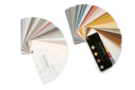
Qualifying for most hilarious licensing deal of the month, The Guggenheim Museum in New York is
licensing paint colors. It's a natural, from a focus group viewpoint. Think about it. Museums have both paint-
ings and they also
paint their walls. Sometimes in non-white colors! So they took colors from famous/old paintings to create a fan deck that looks like, well, like most paint fan decks, except with fewer true greens and oranges.
Don't get me wrong, I love me some creative licensing. Frankly I don't care if it's off-mission or off-brand or off-message or whatever constructions end up limiting original thinking. But if you're going to go off-road with your product, it should at least rock the party microphone. These colors are very, very nice! But are the hues really any different than just picking the same color chips from
other fine paint company's existing palettes? And are the colors really unique to Guggenheim? If Fine Paints Of Europe (whose paints rock, by the way) did this with a Cezanne in MoMA wouldn't the end result be the same? The product looks nice, but the branding feels flat.
My favorite part of the press release:
Friday, 18 September 2009
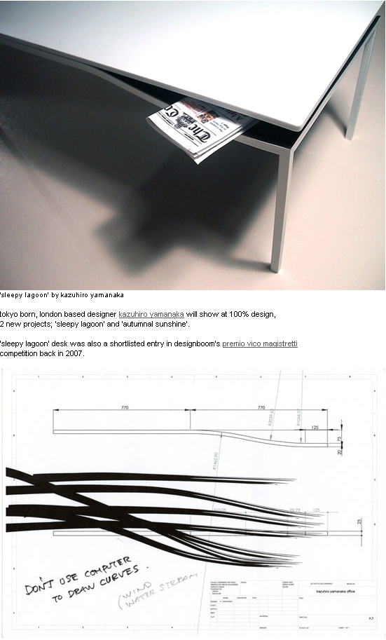
Sleepy Lagoon Table

Today on Tropolism: three Japan-related posts.
First is Kazuhiro Yamanaka's furniture at the 100% Design show in London this year. My favorite is the pictured Sleepy Lagoon Table, particularly the concept sketch which reads "don't use computer to draw curves." We couldn't agree more.
Tuesday, 8 September 2009
Slave To The Sitting

I just couldn't help myself.
Chair Whore rocks my world. It's got picture after picture of awesome chairs. It's now encyclopedic, and not wikipedic. It's ilikeapedic.
Advertisement
Support our advertisers because they help keep the content free.
If you're interested in advertising, contact us.
Wednesday, 2 September 2009
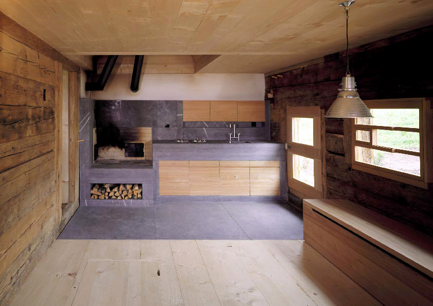
Alpine Hut Goodness
 Swiss architecture firm Andreas Fuhrimann Gabrielle Hächler did this renovation of a two century old alpine hut in 1997. They managed to bring out the beautiful existing qualities of the hut (its heavy timber beauty), while adding some gorgeous stone elementalness of their own.
Furniture Friday: Alex Hellum
 In Tropolism's world, we get excited about furniture when it bleeds into the realms of sculpture and architecture. Added to this group is Alex Hellum, a designer in London whose pieces are whimsical and a little like creatures walking around the living room.
Seated at Designboom.
Flat Flat

There has never been a concept too experimental that it needn't be built in Harajuku. Jean Snow points us to Flat Flat, a space where visitors can experience the online games portal Hangame. As a retail space it is an oddity: highly expressive, yet not much there except a bunch of computer screens. As a concept it is arguably redundant (if the games are online, isn't the point that you play them against people far away?), which also makes it highly unique.
Also we're really into the neon ceiling.
Picture found at designboom.
Less Stuff Is Better Design

I know I've been harping about this since I first got the idea for the Two Dozen list in 2004: the Roaring Two-Thousands created a lot of drek by designers because they were "designers", not because the designs were actually great. A lot of my writing has been focused on pushing designers to do better. What better opportunity for designers to really push design when all this money is sloshing around? Why not make things more efficient, more accessible, more inventively designed, and more beautiful, even if it costs a bit more? When the cycle downturns, we'll be happy to get scraps from the woodpile to make our stuff. Since September, most of us have been looking for that scrap pile.
Michael Cannell over at The Design Vote wrote a great article in the New York Times encapsulating these sentiments, looking quickly (as in long-blog-post quickly) at where product designers and architects are going to go from here. He champions sustainability in the production of goods and a good project by Lorcan O'Herlihy architects in Los Angeles that champions density over size of lawn. Welcome to the end of the decade, folks. We couldn't be more thrilled.
Jewelry Store In Paramus, New Jersey, Gets Lots Of Jungle

In one of our past life incarnations, we did a lot of work designing high-end retail. It's a great way to exercise design ideas that must explicitly reach beyond spatial concerns and go far into up-to-the-minute marketing ideas and branding concepts. In addition the design must be flexible enough to allow for the cycle of product iterations and ever evolving store upgrades to take place. All on a budget.
Some architects can't get this right to save their lives. Fortunately most brands can't afford to indulge an architect's natural tendency toward academic foolishness in these sorts of endeavors. Of course, in Switzerland, they apparently do things differently and let the architect do the whole darned mall, complete with a cheeky store dedicated to his books. Thank you Daniel Libeskind, you have completely missed the point yet again, slashing it with even more diagonal windows.
Through these eyes we see the new Tanishq jewelry store, in the Garden State Mall in Paramus, New Jersey. It is part of a series of stores by Pompei A.D., brandingarchitecture specialists based in New York City. We like the store concept because it looks less like a store and more like a jungle cave. In the context of the never-ending sell assault that is the space of a shopping mall, it creates a literal oasis where the senses are invited to explore. Your guard lets down, and then they pounce with the expensive jewelry you uncover in your adventure. Pay down our credit card, we're ready to go.
Unearthed on Arch Daily, who have lots of jungly pictures.
Furniture Friday: McHale Chandeliers

Coolhunting has a great interview with Michael McHale, whose chandelier is pictured here. As any interior designer knows, finding the right chandelier is often a project in and of itself. McHale offers a direction just recently being explored by designers: rough yet beautiful DIY constructions.
Tuesday, 25 November 2008
More Miesian Delusions

Again with the Newsletter: last week I referenced some Miesian Delusions I came across the last few weeks. Another one opens tomorrow in Barcelona: SAANA is taking their bendy-glass-reflection-space to Mies's Barcelona Pavilion with a temporary installation. They have installed a semi-transparent acrylic curtain spiral. The curtain lets the visitor continue to visually see Mies's original space, but adds a layer of reflection and circulation that did not exist before. It's of the appropriate subtlety for the already-perfect Pavilion. We can't wait to see actual installation pictures.
Alerted by Designboom, who have more renderings.
Useless Furniture

Joe Velluto Studio, based in Vicenza, has a new exhibition called "Useless Is More". Now that our shopping frenzy of the last 7 years is finally over, we can get back to making art again. Joe Velluto does this by creating pieces that are recognizable as real furniture or design objects, except that they are, well, useless. They are approachable and designless like something from a yard sale or Ikea, and then they turn on you. And, of course, there is no way or reason to purchase them. It's a breath of fresh air.
Via Designboom.
Thursday, 20 November 2008
The Most Awesome Yoga Studio Ever

Yoga Deva is a yoga studio in a strip mall in Gilbert, Arizona. Yet is has the distinction of being the most awesome yoga studio ever. The project derives its power by being hyperminimal while at the same time sensual. Visitors enter through a long entry hall with rich walnut, plaster, and aluminum leaf wall finishes. However the main space turns into a quiet study of different lighting conditions; one only need to see the photographs to see how powerfully the light changes in the space. The main space's curved ceiling and innovative translucent scrim on the entire window wall perimeter are particularly stunning. It is a great place to practice your mind/body connection. It is the work of Blank Studio of Phoenix.
Check out the web album to see the rest of the gorgeous picture set by photographer Bill Timmerman. All pictures courtesy of Blank Studio.
Sori Yanagi, Friend Of Your Home

Sori Yanagi, long considered the Charles and Ray Eames of Japan, has designed so much flatware, mixing bowls, dishes, cutlery, kitchen tools, pots, pans, plates, that you are able to stock several kitchens. If you can get the stuff. MoMa, bless its heart, does its usual thing of giving us a few bits (5 pieces of flatware). You can get more of the flatware at Unicahome, for the completists among us (like me!) who need that shellfish fork to complete their collection.
What's less readily available in the USA and Europe are the plates. I had the honor of being received by Mr. Yanagi in 2004 at his studio, and after showing me his prototypes for the latest pots and pans, and his to-kill-for book collection, he showed me the shop upstairs. There were half a dozen lines of plates, some of handmade/handpainted ceramic, others more modern. Our favorites were the rounded square black and white plates (pictured above in the lower left), if only because they were microwave safe and had matching tea cups, saucers, and every shape of plate one could imagine. At the time the only way to acquire these was to purchase them at the store and have our hotel ship them back to the USA; we're happy to say that these days you can get them from the Japanese online store designshop, who will arrange shipping overseas via major shippers. I am also partial to the Marumon series (and the companion Musubimon series), also pictured above at lower right. Designshop has this and several other pieces, including the iconic bird-shaped soy sauce pitcher (pictured above left).
Furniture Friday: The Chrome Almost-Superleggera Chair

Continuing our theme of Gio Ponti inspired awesomeness comes this pair of chairs done up like Ponti's famous Superleggera chairs. Except these are from the 1970s and are shiny polished chrome. Of course it's possible to find other examples of this, but on this site the attribution to Ponti is incorrect: Superleggera has triangular profiles to the legs, the chrome versions are elliptical. It turns out the steel version is none other than Phillipe Starck's Objet Perdu chair from 2004(?). But they are cool nonetheless.
From the ever-scrumptious Remodelista.
Furniture Friday: Gehry's Swoopy Bench

Speaking of swoopy bench-like sculptures, Frank Gehry has done one for the World Company building in Tokyo, just in time for Tokyo Design Festival. It's worth comparing his to Zaha Hadid's. Formally they are similar: complex curves that you can sit on. They sit in a space, but aspire to some kind of kinetic reflection of their present surroundings. But the materials are very different. Gehry's piece could be made by basket weavers; Hadid's requires a lot of bondo and an apprenticeship in auto body repair. I like them both, but Gehry's piece is a reminder that the build manifestation of complex forms is not always seamless shiny material.
As seen at Core77.
Furniture Friday: Thonet for Muji (Correction)

In what is probably the most brilliant tie in ever, Muji is selling new chairs designed (but not-designed, right?) by Muji but produced by famous Austrian manufacturer Thonet. The bent wood "design" is a riff on Thonet's famous No. 14 Chair. They also do a tubular steel design riffing off of the later Bauhaus pieces Thonet produced. Check out their cool PDF explaining their tie in to history.
Thursday, 30 October 2008
Furniture Fridays: Nightwood In Brooklyn

Nightwood in Brooklyn is a shop that revives old chairs and recycles furniture scraps, all the while maintaining a clean look. But not too clean: the furniture keeps enough of its rough edges without getting too rustic on you. Our favorites are the Dusk Plank Dining Table and the Sunrise Chair (pictured). The shapes never get too modern, which means they rely almost entirely on the character of the individual scraps to push a design into new territory, meaning this is less the work of a designer and more the work of a curator/editor. Which is awesome.
Discovered through the always-fresh Remodelista.
Furniture Friday: Platform's Occasional Tables
Furniture Friday: Gio Ponti Coffee Table Makeover

Tropolism means design by doing it yourself.
Materialicious gives us a great coffee table makeover, inspired by Tropolism favorite Gio Ponti's Paolo console table. It's not in screen-printed leather like the original, but it's an inspired idea regardless. Stay tuned with them for how-to instructions.
The Glass From Terminal 8

In February the 1960 stained glass window at JFK's terminal 8 was demolished. The window was over 300 feet long and 23 feet tall; it was designed by Robert Sowers for the 1960 American Airlines terminal. Our picture is of the terminal when it opened.

What the articles at the time neglected to mention is that most of the window was salvaged by Olde Good Things in Manhattan. That link has lots of juicy demolition details. We happened to spot one of the pieces in their store window while passing by. Some of the window was destroyed before OGT jumped in and took the remaining window to their warehouse in Scranton, Pennsylvania. They numbered the sections and it is now possible to buy large sections of the window for reassembly elsewhere. So while the window did not find a permanent home, and it will undoubtedly be broken up, at least it's in good hands. And it's possible to put large swaths of it back together, if you have the spot for it.
Furniture Friday On Wednesday: 15 Architect-Designed Chairs
Furniture Friday: MH005 Coffee Table

In the venerable tradition of naming your funiture designs with your initials and a number, Matthew Hilton gives us the MH005 Coffee Table. The profile reminds us of a lot of Latin American architecture, starting with Gio Ponti's Villa Planchart in Caracas. But this table is from Brazil, not Venezuela, and carries all the gorgeous hardwood craftsmanship any collector of modern furniture would expect from that country.
Furniture Friday: Stingray Chair
Build Your Own Apple Store
City Colors

One of the things we like to celebrate is color. Certain design professions have more sophisticated approaches and dialogues about color than architects: interior designers and graphic designers, to name two. The latter category, in the person of Todd Falkowsky, has created a series of color strips for each of Canada's provincial and territorial capitals. The result is interesting, particularly the observation about how intuition informs the process. What we'd like to see is a whole color pallette, not just a test strip of three, for each urban area. Huge samples that would represent each city.
Via Brand Avenue.
 Qualifying for most hilarious licensing deal of the month, The Guggenheim Museum in New York is licensing paint colors. It's a natural, from a focus group viewpoint. Think about it. Museums have both paint-ings and they also paint their walls. Sometimes in non-white colors! So they took colors from famous/old paintings to create a fan deck that looks like, well, like most paint fan decks, except with fewer true greens and oranges.


