TROPOLISM
Thursday, 13 October 2011
Guggenheim Museum Licenses Colors; Towel Bars and TP Holders Coming In 2012
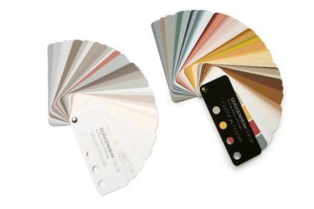
Qualifying for most hilarious licensing deal of the month, The Guggenheim Museum in New York is
licensing paint colors. It's a natural, from a focus group viewpoint. Think about it. Museums have both paint-
ings and they also
paint their walls. Sometimes in non-white colors! So they took colors from famous/old paintings to create a fan deck that looks like, well, like most paint fan decks, except with fewer true greens and oranges.
Don't get me wrong, I love me some creative licensing. Frankly I don't care if it's off-mission or off-brand or off-message or whatever constructions end up limiting original thinking. But if you're going to go off-road with your product, it should at least rock the party microphone. These colors are very, very nice! But are the hues really any different than just picking the same color chips from
other fine paint company's existing palettes? And are the colors really unique to Guggenheim? If Fine Paints Of Europe (whose paints rock, by the way) did this with a Cezanne in MoMA wouldn't the end result be the same? The product looks nice, but the branding feels flat.
My favorite part of the press release:
Wednesday, 13 January 2010
Denver Art Museum: The Castle And The Bower
Okay let's get this one out of the way: Gio Ponti's Denver Art Museum is not his best building. It would be nobody's best building. But it is a very brilliant building, even though it tries a lot of ideas that don't always work.
Works: the basic premise. Instead of being a classic big, sprawling, flat, three-level supermall of art, like the Metropolitain Museum in New York, Ponti stacked the museum in a seven-story castle-like structure. Every floor is devoted to one area of specialty, which made it like entering a special realm devoted to that area. For collections that are not as strong in Eastern Seaboard museums, like American Indian Art, Western American Art, or Spanish Colonial Art, this effect of specialness is pronounced. What are usually the leftovers in museums with powerful Renaissance Painting collections are here the primary reason to visit. While the arrangement sacrifices some curatorial connections between periods and cultures by this separation, for this museum and the particular collections it specializes in, it works.
Works, sometimes: the castle idea. The building looks like a castle, and against the snowy mountains surrounding Denver, the conceit really works. I personally think it looks cool: it's straight out of Domus 1956. Not cool is the fact that there is a large concrete fence around most of the museum. It's not very friendly to many of its street faces.
Works, mostly: the windows. Because a lot of natural light is not desired, Ponti only cuts the building here and there to let little slivers of views and light to enter the exhibition areas. Again, for this particular collection, the presence of a direct window out, as small as they are, works. But barely: for painting collections, and many artifact collections, the windows are a curatorial problem. But for many of the collection areas (see above) the connection to the outdoors, and particularly to views of the Rocky Mountains, is welcome and desired. This museum is brilliant in its success in continually sequestering you for art viewing, and then giving you little moments of looking at outdoors which is totally not an art moment. Art Mall Fatigue is not a problem in this museum, a strength not shared by almost every other museum I've been to. Another powerful piece to this experience is that the main stairwell between floors is a concrete shaft with colored tiles. Yet to get to this shaft you leave the museum, go into a small outdoor space, and then go into the stair. The stair itself is rather brutal, but the experience of leaving the warm museum and going into the (usually) cold Colorado air is unique to most museum experiences.
Doesn't work: the materials and finishes. The thing looks a tad dated. The colored glass tiles on the exterior and in the stairwells scream 70s Italy, but I don't mind. It's the dusty florescent lighting, some worn exhibition displays and carpeting, and a strangely mismatched furniture collection that needs some help.
Doesn't work: the whole entry sequence. There's a cute little stair/overlook thing going on connecting the first three floors, but it's accessed through an empty exhibition room which is around the corner from the main entrance. Some of this is because the entry sequence has been reworked by the addition to this building.
Next we get to The Bower next door to The Castle, namely Daniel Libskind's addition. It's a lot of shards thrown together and the interior is shards and angled walls. You know the drill, no need to visit it really. However Leibskind's building is easy to get to, works well with its surroundings, and looks great on the outside. Inside, the spaces are a tad disorienting and at times annoying. Even the signage is tilty. RADICAL. It is saved by a powerful installation of contemporary art, but that is more of a compensation than a utilization. Ponti's windows are nothing short of subversive interruptions to the normally smooth consumption of art, and the technique is like an alternating current: on, then off, then on, then off. Libskind's building seems to just be a crazy-space way of framing art consumption, and it feels flat. It comes across like two people shouting at the same time. It's not as satisfying a solution because it does not seem to offer anything to the art except a pain in the ass.
On the other hand, the two together work really well, and Libskind's addition of course must be seen in this context. He's solved the biggest shortcoming of Ponti's museum: its presence in the city. The DAM is now cool again, and it's because it's composed of two buildings by design powerhouses.
Olafur's Skateboard
Advertisement
Support our advertisers because they help keep the content free.
If you're interested in advertising, contact us.
Tuesday, 10 November 2009
Charles Sheeler Architecture
Baldessari Does Mies

"Brick Bldg, Lg Windows w/ Xlent Views, Partially Furnished, Renowned Architect" is John Baldessari's new installation at the Haus Lange from 1928, in Krefeld, Germany. The project furnishes the house with Baldessari's surreal nose- and ear-shaped furniture. In addition, the windows are lined with pictures of California seascapes on the inside, entirely blocking the views to the exterior, and reflecting Mies's indoor-outdoor connection back inward. From the exterior, the windows are lined with pictures of bricks, further killing the Mies effect.
The effect is deadening, and powerful. It causes the visitor to notice the power of Mies's original arrangement, the levels of zig-zag transparency, the scale of the glass, the pervasiveness of the brick both inside and out. In a way, the project celebrates Mies, even as it temporarily disrupts the way the house works.
U.S.A.'s Venice Biennale Pavilion Comes Home
[photos courtesy of Rain Yan Wang]
Earlier this month, the U.S. Pavilion from the 2008 Venice Biennale opened at the Sheila C. Johnson Design Center at the New School. Into the Open: Positioning Practice attempts to realign architectural thought towards socially relevant issues. All sixteen studies ask us to “reclaim a role in shaping community and the built environment, to expand understanding of American architectural practice and its relationship to civic participation”. Highlights include Teddy Cruz’s examination of the border crossing between San Diego and Tijuana as well as Laura Kurgan’s view of incarceration through Architecture and Justice.
Upon entering the gallery, we found the exhibition’s rhythmic series of text intensive pilasters to be a bit daunting and overbearing. The models and graphic components receded into the background as they were clearly overshadowed by the bold text. However, as the evening wore on, the exhibit’s true potential emerged. Within the niches of the display’s formal structure, patrons were invited to contribute their own personal touch. A tertiary artistic endeavor superimposed itself upon the gallery. The interactive quality served the dual purpose of contextualizing the exhibit while reminding us of the continually shifting dynamics of the social order.
Posted by Saharat Surattanont.
Tropolism Lectures: Gentrification Begins
 Gentrification, suburban sprawl, homogenization----we all have our takes on it. Inflated rents, overpriced restaurants, and multiple Starbucks are the clear symptoms. At the Municipal Arts Society talk at the Urban Center on Wednesday night, Francis Morrone takes us back in time to examine the origins of gentrification in New York City. Strikingly, it may have been started by a handful of progressive and socially conscious women.
Click here to read the rest of the lecture report...
Wednesday, 14 January 2009
WTC Model

The American Architectural Foundation has donated the original model of the World Trade Center to the September 11th Museum. The Museum has another name but it is ridiculously long and focus-grouped and I refuse to use it. The 7-foot-plus model wonder of the world was constructed by Minoru Yamasaki Associates and has survived because of great care.
I saw this model in 2004 when it was displayed at the Skyscraper Museum and it's a powerful thing. That museum is close to Ground Zero but a bit off the beaten path in Battery Park City. Visiting during the day I had the model to myself. It was a powerful experience: the model was my new memorial. The model is huge, a technical achievement in its own right, not just in construction but in the extreme stewardship needed to keep it in good shape. And yes, it's significant and ironic that a paper and plastic model outlived a huge building complex. It's a powerful reminder of what was lost seven and a half years ago.
Palladio Ever More

In celebration of the new Palladio show at the Royal Academy, The Guardian has published a piece celebrating the man himself. While they use the Villa Capra as their title picture, we always thought that one a bit over-photographed. We've always been more partial to Villa Poiana (pictured), which when we visited it in 1995 was pretty much open to the elements. It's stark in its not-new state, and it's possible to see where all the modernists like Corb got some of their early ideas. If you visit the Royal Academy link, you will see, low and behold, someone else likes the Poiana too: its unique exterior is their thumbnail image for the show.
Wednesday, 7 January 2009
24 Hour Guggenheim

Last night at 6pm, the Guggenheim began its 24-Hour Program on the Concept of Time. Presenters included architects, artists, philosophers, writers, anthropologists, etc. Like any academic conference, lucidity and brevity comingled with pointless meandering. I suppose temporal musings may demand the non-specific thought processes that I saw last night and this morning. Below are highlights from the conference--at least the way I remembered and experienced the moments.
Continue reading and more pictures by roving New York City correspondent Saharat Surattanont.
Thursday, 11 December 2008
Manhattan Street Corners

Between March and November 2006, Richard Howe photographed every street corner in Manhattan. Yes, he took pictures of all four corners too. The images are powerful because of the close cropping of the buildings on that corner: you get a generous panorama of the bank or deli on the corner (or, being 2006, construction scaffolding) and not much else.
There are roughly 11,000 street corners in Manhattan. The New-Yorke Historical Society is going to include them in their collection. As Howe alludes to in the text on his page, it is interested to see what he defines as corners. Is a corner a street intersection? For instance, where Broadway collides with 5th Avenue, just above the Flatiron Building (and now a pop-up park), there appear to be multiple pictures of the same corner, due to how he is defining corners. Hopefully they will all appear in a room together with some sort of map to document the process. However they are displayed, they are a powerful record of our messy, disruptive city life, systematically organized.
Via Materialicious.
Tuesday, 25 November 2008
More Miesian Delusions

Again with the Newsletter: last week I referenced some Miesian Delusions I came across the last few weeks. Another one opens tomorrow in Barcelona: SAANA is taking their bendy-glass-reflection-space to Mies's Barcelona Pavilion with a temporary installation. They have installed a semi-transparent acrylic curtain spiral. The curtain lets the visitor continue to visually see Mies's original space, but adds a layer of reflection and circulation that did not exist before. It's of the appropriate subtlety for the already-perfect Pavilion. We can't wait to see actual installation pictures.
Alerted by Designboom, who have more renderings.
Ouroussoff: Please Get A Photographer

As those of you who signed up for the Newsletter already know, I wrote a little about Nicolai Ouroussoff's review of Frank Gehry's new building in Toronto.
A quick recap. A couple of weeks ago, the New York Times included a review of Frank Gehry's addition/reorganization of the Art Gallery of Ontario, in his birthtown of Toronto. Nicolai Ouroussoff gives Gehry his usual loving treatment, including a few gilding words about the building's new integration into its urban setting, which are barely hinted at in the accompanying photographic essay. So we will have to take his word for it, apparently. Actually, I'm kind of tired of taking their word for it. Can we see some proof? Or at least have the pictures align with the words a little better? I think this is probably an editorial problem. They send the architecture critic and a photographer to the building at the same time. They visit, and it is only later that the critic constructs his argument. The photographer has already taken the pictures though. But couldn't Ouroussoff (whose work we like!) take some snapshots as backups and then use them to fill the gaps? And half of the photos in the slideshow are from Gehry Partners anyway, didn't they have a couple that could help Ouroussoff better? It's a little distressing. And it's symptomatic of why print media, even in its online editions, is going to fall to The Blog, particularly with regards to writing about the city. Print is never messy. The city and blogs are.
So it's not without a little bit of frustration to see Mr. Ouroussoff's latest post, today about some theoretical museum by Toyo Ito (who we love), which includes two 'eh' renderings (one pictured above) and a lot of words about how the design is great. Really? Tropolism means pretty pictures. It also means good-awesome and accurate renderings. We just want more.
Mr. Ito, you can send more/better renderings using our submission form at the right.
Tropolism Exhibitions: Actions : What Can You Do With the City

Tropolism means taking action.
Fittingly the CCA is opening a show November 26th titled Actions: What Can You Do With the City. The exhibition explores 97 actions that "instigate positive change in contemporary cities around the world". Our favorite part, however, is an online toy that generates specific actions you yourself right now can take in the city, actions that are outlined in the show, essentially putting the exhibition to work. Worrrk! Now this is Jane Jacobs for the 21st Century.
Tuesday, 18 November 2008
Tropolism Exhibitions: Toplight

In keeping with our museums for antiquities theme, we were interested to see the Berlin museum for the Temple of Pergamon show up in the press images for Toplight, a review of architectural skylights at the CCA in Montreal. In a masterful ironic statement, the Pergamon Museum's "1904 museum catalogue claimed that the Pergamon altar could be appreciated in its 'original light'." The exhibition is organized around case studies from the last couple hundred years to track natural skylighting in architecture.
The Pyramids In Today's Egypt

Today The New York Times posts a little memo from Cairo touching on the relationship of modern Egypt to its ancient past. These are issues touched on in the book we finished recently, and the article stars Zahi Hawass, the cultural minister so prominently featured in Loot.
“A man without history is a man without humor,” said Galal Amin, an economist and author who has written about Egypt’s modern decline. “A man with history is more likely to have humor, because he is more likely to see the irony in things, how things were and how they turned out to be. And patience.”
Wednesday, 12 November 2008
The New Acropolis Museum: Almost Open

Reading Loot got me wondering how far along the new museums underway in Cairo and Athens were. The New Acropolis Museum, designed by Bernard Tschumi, is complete and they are moving the artifacts in. There was a great walkthrough of the building here. All that's left, of course, are the Elgin Marbles. We've always wanted them relocated simply because they are so terribly displayed in the British Museum. The book clued us into the fact that the other half of the marbles pretty much live in Athens, and that the new museum there has already prepared space for the returned Elgins. The new building looks perfect for the location, and the subtle ways it mimics the experience of visiting the nearby Acropolis is exactly what this building needed to do well. Tschumi does monumental and it's a hit.
Furniture Friday: Richard Prince's Furniture Show

Richard Prince's latest show at Gallerie Patrick Seguin, in Paris, shows off an interest in furnishings, including his new "Nurse Hat Chair". The other pieces in the show are from his collection, and are arranged in a way to display his rare book collection. As a work of editing and collecting--and by that I mean as an extension of Prince's paintings and photography--it's a fascinating set.
As seen at DesignBoom, where they also have more pictures of the show.
Thursday, 6 November 2008
Pretty Pictures: Drafting #1
Tropolism Exhibitions: to: Night

Hunter College's ambitious exhibition to: Night includes a large scale neon installation at the college's aerial walkway, Infinite Light by Laurent Grasso. We have been milling around that part of town a lot lately, and noticed it right away. However we were a little underwhelmed, after seeing what's possible, first hand, day or night, with neon walkways. But we admire its scale, and hooray for Hunter College for doing something this ambitious. More, and more often, please.
Pieces in the show we are more excited about are those from photographer Susanna Thornton (pictured), whose Nightstills series captures both the romance and fleeting nature of light at night, even in the most routine situations. We are particularly drawn to the pieces that show a little foreground, taking them out of the realm of simple out of focus beauty and into an implied narrative.
Also of interest are the illuminated (model?) trees by maquette/lightbox/installation artistDoina Kraal.
Thursday, 23 October 2008
Next Generation House Update: Winner!
Herzog & DeMeuron's Tate Modern Mountain
Zaha And Chanel Do Up Art

The Chanel Pavilion Of Contemporary Art, Seriously or whatever it's called gives you all of its formal secrets before you get it. It's swoopy. It's modular fiberglass. It's Chanel! It's hard to miss that on the outside, but the utopian aspirations are given a distinct flavor. There are creepy helpers scurrying around in their black coats and black ball caps: they only look like jackbooted fascists in a retro-sci-fi movie, even though they say they're just taking tickets. It's helpful to write about this project in three parts:
Architecture: Zaha designed a swoopy container. It's interesting, but the swoops get old fast, and the construction is still very Early-Swoop-Technology: some great fiberglass panel stuff but all the connections are held together by schmutz. And a few well placed screws where things didn't quite work out. All the ceilings are made with a terribly cheap looking stretched tent fabric material. Things that art containers need, like lighting, are relegated to black painted openings between stretch fabrics. Often the unpainted 2x4 wood blocking under the track lighting is visible. Gorgeous. But the ambition is incessant, which is why we love Zaha, and you have no choice but to accept it (otherwise just go find a rock in the park to sit on). Check out the excellent slideshow at Curbed.
Art: With few exceptions, highly derivative or too understated to stand against/work with The Container. For some reason they all have Chanel as their theme. It's meant to be a theme that ties them all together. It's not a very good idea. However there is a powerful slideshow by our favorite bondage photographer Nobuyoshi Araki, and some very disturbing photographs by David Levinthal. And a piece by Leandro Erlich called Le Trottoir (The Sidewalk) that one needs to experience for something like 50 minutes, not the 5 minutes they give you before you're shuttled away.
Narration: The Container cocoons you in many ways, notably by covering your ears with headsets and an MP3 player that you cannot touch without screwing everything up. They let you know. And so you are torn from your companions and given a decent soundtrack and narration by Jeanne Moreau (who we love). At first I thought it was Zaha. Easy mistake to make: the narration script is hilariously pretentious. The problem is that the art isn't really sequenced the way the continuous soundtrack and narration suggest, it's just a bunch of separate pieces (that vaguely relate to the space and Chanel, yes) and someone has put cinematic schmutz in the gaps between them. We applaud the idea of seeing what is mostly New Media Art this way, but it's light years behind interactive media as accessible as Call Of Duty 4. It's a way of seeing art that is under explored. The Container poses the problem, but the results are mixed.
Tropolism Exhibitions: Vanishing America

We are midwesterners, so we understand how fragile most of these structures are. They are remote. They are owned by people who use them for a purpose, not fawn over them for their aesthetic value. They have no publicity machine behind them.
Michael Eastmen captures decaying vernacular American architecture in his new show and book Vanishing America. The show runs through July 19 at DNJ Gallery in Los Angeles.
Thursday, 28 February 2008
Tropolism Exhibitions: Julius Shulman: Palm Springs

Tropolism took a vacation to sunny Palm Springs, California. While there we were fortunate to come across Julius Shulman: Palm Springs at the Palm Springs Art Museum.
This was our first trip to Palm Springs, and we spent the first few days looking up our favorite buildings in the area, as well as coming across some surprises, such as Albert Frey's 1960 Schiff House, now being renovated.
Only after we had done this initial exploration did we discover the Shulman show at PSAM. The show is at once a focused retrospective of Shulman's work (concentrating on only the Palm Springs buildings he photographed) and a survey of great modern buildings in Palm Springs. On display is Shulman's famous image of the Kaufmann Desert House, a picture many architects probably see in their minds when they think of Neutra. Yet equal emphasis is paid to Neutra's Maslon House, stupidly demolished in 2002. The images are supplemented throughout with original architectural renderings, floor plans, and elevations, further emphasizing this as a survey not just of Shulman, but of Palm Springs Modernism. The show is helpfully organized by architect.
Our only complaint with the show is its arrangement. Because much of the show is on free-standing partitions, either permanent or specially built for the exhibition, it does not lend itself to wrapping around corners the way a traditional 4-walled room does. Yet the show wraps, and wraps, and it is sometimes impossible to understand where to proceed next to see the rest of that particular architect's oevre. The architects are given large numbers next to their names, yet some of the architects are displayed out of numerical order. These are minor issues, but from the standpoint of anyone who has designed exhibitions, it is bewildering to see such freshman flubs at all.
Even though the architectural celebutantes are well-represented (Richard Neutra, Albert Frey, and John Lautner), lesser known architects are given equal time (Paul R. Williams and A. Quincy Jones, Dan Palmer and William Krisel, Donald Wexler, William Cody, and E. Stewart Williams). There are fewer masterpieces among this group, but they arguably have had a more powerful voice in shaping the character and culture of modernism that exists in Palm Springs. They shaped it both through the sheer number of good-to-great buildings in the Coachella Valley, and the breadth of their talent, imagination, and interests. E. Stewart Williams is case in point: he designed the 1946 Frank Sinatra House, the beautiful 1954 Edris House, and the equisitely detailed 1957 Santa Fe Savings and Loan Building. (which we drove by a dozen times on our long weekend) and, of course, the building housing the exhibition. There are few places in suburban America that can lay claim to this much per-capita Modernism.
Special thank you to Stephen Monkarsh, proprietor of Palm Springs' best collection of architectural books, who directed us to the exhibition. Julius Shulman: Palm Springs is also a great book, available on Amazon.
Tuesday, 19 February 2008
1970 Pepsi Pavilion Blows Minds To This Day

Pictured is the Pepsi Pavilion at the 1970 World Expo in Osaka. Greg Allen says it best:
Holy freakin' crap, why has no one told me The Pepsi Pavilion at the 1970 World Expo in Osaka was an origami rendition of a geodesic dome; obscured in a giant mist cloud produced by an all-encompassing capillary net; surrounded by Robert Breer's motorized, minimalist pod sculptures; entered through an audio-responsive, 4-color laser show--yes, using actual, frickin' lasers-- and culminating in a 90-foot mirrored mylar dome, which hosted concerts, happenings, and some 2 million slightly disoriented Japanese visitors?
Geodesic; mist; 4-color laser show; mirrored mylar. After those words we don't even need to know the rest of the details.
Piano Gets Smacked, Deservedly

Today Nicholai Ourousoff puts the smack down on Renzo Piano's Broad Contemporary Art Museum, and addition to LACMA that has recently opened. From the photos in the article and the photos on LACMA's own website, we are left with a collective "HUH?". It's a little bit o'travertine, with a little bit o'Pompidou (via the 1980s). Or, perhaps bit o'Getty with bit o'Hugh Hardy (who did the awful 1986 Anderson Building at LACMA). And don't get us started on the flimsy entry pavilion, pictured. We like to think Mr. Ourousoff was channeling us when he said it:
And if to some the entrance pavilion’s flat, square canopy brings to mind a gas station, the reference falls flat. I’ve seen gas stations in Southern California with far more architectural ambition.
PS1 Goes Agricultural, Finally

Work Architecture won this year's PS1 Warmup Series installation with their cardboard-tube urban farm. While the New York Times gives us some back story (heavy on the Barry Bergdoll, obviously the driving force behind the change of direction), we think that Pruned says it best:
Where sightseers once splashed about in silly algorithmic frotteurism, they will be treated this summer to an $85,000 community garden, whose “rural delights” will probably not go to supplement the nutritional needs of the disenfranchised but rather will go to make bloody marys and beer for architecture students.
Seriously folks, "silly algorithmic frotteurism" pretty much says a lot about a lot these days. That, and Pruned's brilliant comparison to Wheatfield by Agnes Denes.
We see this one as the successor to PS1 Warmup Series' last successful installation, the one in 2004 by nArchitects. The intervening years can now be forgotten, just as we forgot Lindy Roy's whatever install.
Wednesday, 23 January 2008
Gerhard Richter's Cologne Cathedral Window
Library Of Congress Images Goes Web 2.0
Tropolism Exhibitions: "Imperative Design"

Opening January 26th is "Imperative Design", radical furnishings from seven designers at Barbara Davis Gallery in Houston. It isn't clear whether the gallery is attempting to outdo Moss or be their retail outlet (some of the pieces are available at Moss; pictured is Arik Levy's Rock Fusion chairbenchtablerock, available for price upon request. While not all of the pieces are new (will Zaha Hadid design another chair, please?), the work presented is interesting, cutting edge, and takes a bias toward computer-generated objects being created in real space.
Oh, and we want a Rock Fusion for our birthday (April 22, we turn 3).
Quote Of The Week

“One should be practical and not too pious,” he told a conference of art historians some years ago. Commercialism pays the bills, he said, and museums are not churches. But “it is the mystery, the wonder, the presence of the real that is our singular distinction and that we should proudly, joyfully proclaim.”
--Phillipe de Montebello, who
announced this week he is stepping down as director of the Metropolitan Museum Of Art after 30 years.
Art: Culture In The Age Of Supply And Demand
Tuesday, 27 November 2007
Tropolism Websites: Sorry, Out Of Gas

We usually don't link to websites from architects: our inbox is filled with them, and the navigation alone usually causes us to run the other way. This one got our attention though. The CCA has launched a companion website for their imaginative exhibition Sorry, Out Of Gas. With this exhibition, CCA has taken the world of architecture to Green 2.0: seeing energy crises and environmental concerns in a cultural and recent-historical context, as a way to shape the dialogue and practices of the present day.
The website interface is simple, and the information is presented as a series of slideshows. We think the touch of having the slide transitions look like real live slides flipping forward (in the days before digital slide programs) is particularly elegant. It's a way of visiting the exhibition that is effective, and saves you the trip to Montreal. If the installed exhibition is big documentary photos on a wall, I'd rather see it online anyway.
Also presented is a work that was found in the press kit: An Endangered Species, a booklet amusingly illustrated by Harriet Russell.
Thursday, 15 November 2007
Nouvel Redefines Towers In NYC

It's difficult to believe, but after Jean Nouvel's sensitive-yet-stunning 40 Mercer, his sparkly-yet-stunning 100 Eleventh Avenue, Jean Nouvel comes through with another groundbreaking design for Manhattan. This time it's for a mixed-use tower next to MoMA. The height will rival the Chrysler Building, and with its open lattice structural top, it may rival the old bird's iconic status as well.
Also of note is Ourousoff's article on the building, which calls attention to the most important issues the building addresses. How private developers are doing more daring architecture than MoMA itself commissioned only a few years back. How this will hopefully correct MoMA's craptacular gallery situation. How an architect can produce a design for a tower while playing with the essential elements of towers that up until now felt played out (the structural system, the curtainwall, the profile), yet all the while creating something new, of our time, and dazzlingly buildable.
Our favorite part is that the developer has chosen to build what others might consider unsellable floors: the penthouse apartment with a huge elevator/stair core. It is brilliantly described as "the pied-a-terre at the top of the Eiffel Tower from which Gustave Eiffel used to survey his handiwork below."
Tuesday, 4 September 2007
Maya Lin Systematic Landscapes

Forgive us for being so slow on the ball on this; a travelling exhibition of Maya Lin's gorgeous new installations, Systematic Landscapes, opens at the Contemporary Art Museum St. Louis this week. Pictured from the show is Water Line, as captured by Jen S on flickr.
Olafur Eliasson and Kjetil Thorsen Serpentine Gallery Pavilion
How Many Stars?

The new London office is hopping. Today they alert us to an review by Hugh Pearman, the peerless architecture critic of the London Times. It's a review of the Global Cities show at Tate Modern. He clues us in to the surprise of the show, as well as it's predictability. A taste:
I’m fond of Gehry, but no, I don’t want to talk to him right now. No offence. Oh, blimey, there’s Zaha Hadid, too. Look, she’s great, but I really must dash. There are days when I just don’t much fancy the big business of world architecture.
Zaha's Shiny Shard

A London correspondent tipped us off to something that is old news over there: Zaha Hadid won a competition for the London Architecture Foundation's new building. And redesigned it. We like the redesign better than the original project, probably because it's like a giant silver version of her gold lego project.
Guggenheim 5th Avenue: Cracking

Yesterday's New York Times served up some technicolor imaging of Frank Lloyd Wright's cracking Guggenheim facade. For anyone that has seen a set of historic preservation documents, this kind of documentation is routine. However, the image from the times takes it to a whole new level of awesomeness.
Serra Installation At MoMA

Our Midtown sidewalk correspondant Sah Surattanont captured the wonderful moment of a Richard Serra sculpture being hoisted into place. In this case, into MoMA's courtyard. Click Continue Reading for the full filmstrip.
Abu Dhabi Update: Louvre Signs On

The Louvre is going franchise. For $520 million, Abu Dhabi has licensed the Louvre name for its previously-titled "classical museum". Read all about it in the New York Times today. While the article is full of details like art exchanges, price tags, and a cursory overview of the financial and political relationship between France and the United Arab Emirates, what really interests us is the new rendering of the underside of Nouvels' dome (pictured), previously reported on here. For us, the global branding of art, a result of the commoditization of art, is of little interest. We want that amazing building to be real.
Tuesday, 27 February 2007
Abu Dhabi Update Part 2: Zaha and Nouvel

This Abu Dhabi wonderland update we are showing off pictures of the models for the designs by Jean Nouvel (pictured) and Zaha Hadid.
Nouvel's scheme for a "classical museum" (possibly a branch of the Louvre) features a huge, flattened dome over an open-air arrangement of smaller buildings. It's like a village, shaded with a space dome. We think it's gorgeous.
Click Continue Reading to see a close-up of the Nouvel dome, and to experience the Zaha model goodness.
Abu Dhabi Update Part 1: Overview, Ando, and Gehry

A few weeks ago we mentioned a new design by Zaha Hadid for a planned arts supercomplex in Abu Dhabi, United Arab Emirates. A special UAE correspondant has provided us with photographs of the exhibition. We weren't prepared for the amount of detail and vigor that went into the models and design of each proposal, and for our correspondant's wonderful close-up photography.
Click Continue Reading for amazing pictures with the Tadao Ando and Frank Gehry proposals.
Robert A.M. Stern Is Almost Alright

Robert A.M. Stern was the critic no one wanted to have when I was a student at Columbia. If you put his studio as anything but last in your preferences, you would get him. It was a widely held belief that if you took his studio, you'd be forced to do po-mo work all the time. This was far from reality, as I learned by sitting in a studio immediately adjacent to Bob Stern's studio, and overhearing his desk crits. Mr. Stern was a pragmatic critic, holding students' feet to the fire on making their projects work, and making their product match their premises. In short, he was an unwavering demand that your proposal live up to your words about it. I secretly loved him for that: Columbia in the mid 1990s was a lot of words and renderings of clouds, and light on the discussion of how buildings work in the world.
Yet a continued disappointment is that while Mr. Stern's office tends to produce architecture that contributes to the city, and is even civic in a traditional sense (in that it is guided by having generous and appropriately grand public spaces), the materials, forms, and sequences rarely thrill. There is no bite.
Of course, in this day and age, good architecture is a category that is hard to find. There is bad architecture, poor architecture, lame architecture, tired architecture, acceptable architcture, not bad architecture, and, occasionally, Great Architecture. But good is a category underrepresented.
We file Mr. Stern's design for the Museum of African Art in the good-to-very-good category. It's an acceptably civic front that abstracts a non-19th century western architectural form, and it has a innovative (but workable!) mix of residential development and institutional functions. And, it's got the best salesman in the business behind an institution without a permanent home.
Thursday, 8 February 2007
Clip/Stamp/Fold

The exhibition "Clip/Stamp/Fold: The Radical Architecture of Little Magazines", on view now at the Storefront for Art and Architecture, is in our world the perfect exhibition: about rare architectural publications, and curated by Beatriz Colomina. The show is only up until February 24th, so rush down. There can never be enough architectural book love.
Until you get there, you may soak up the magazine goodness at the show's excellent (and simple, yo. Take note architects!) website. Mr. Ourousoff from the Times has also reviewed the show today.
Skin + Bones: Fashion and Architecture at the Museum of Contemporary Art, Los Angeles

Happy opening night crowds hovering around Greg Lynn’s bubble wall for the Slavin House.
When a colleague mentioned the title of the “Skin + Bones” exhibition to me a few months ago, I had to repress the impulse to vomit. It’s rare that I have such episodes without a heavy night of drinking, but the thought of pinning such an obvious title to such a tired topic evokes turmoil in even the most solid of stomachs.
Had I known that the exhibition would be so well produced, so perfectly in sync with the thesis of mixing fashion with architecture, I might have saved myself the gastronomic discontent. In fact, I think that even the most cynical of mind will find this show a delight to the eye, and a moderate mental work out to the mind. It’s certainly “theory-lite”, but it fulfills the need to simultaneously educate the public about something they tend to take for granted: Fashion + Architecture.
Click Continue Reading for the rest of the review.
Wednesday, 13 December 2006
Broken Chain: The Genes of the GenHome Exhibition

On a sunny afternoon in late November, I rolled over to the MAK Center at the Schindler House on Kings Road in order to make sense of GenHome - An exhibition of digerati-leaning architects who are engaged in “Genetic Modifications” of the Schindler House. The show was guest curated by Eran Neuman, Aaron Sprecher, and Chandler Ahrens of Open Source Architecture, and features work from both local and global practices such as Greg Lynn’s LA-based practice FORM, and Servo.
And that’s about all I could make of the content of the show.
Click Continue Reading for more.
ICA Boston Opens
Nicolai Ourousoff reviews the recently opened Institute of Contemporary Art in Boston in today's New York Times. The new building, designed by Diller Scofidio + Renfro, apparently makes maximum use of its cantilever. Another triumph for innovative design. Let's hope Lincoln Center fares as well.
Tuesday, 28 November 2006
Whitney: So Over UES

The New York Times reports today that the Whitney is not only mildly interested in expanding downtown near the High Line: they are totally interested.
Favorite near-sighted neighbor quote of the week:
Now the Upper East Siders who vehemently opposed the expansion in their neighborhood are celebrating. In an e-mail message last week to fellow members of the Coalition of Concerned Whitney Neighbors, Edward Klimerman wrote, “Hope springs eternal.”
Wednesday, 25 October 2006
Highline Vacuum To Be Filled By Rush Of Upper East Side Cultural Institutions

Tropolism is making connections.
Today's relationships in news. First, the Dia Art Foundation--caretaker of rockin' artworks like the Earth Room and Broken Kilometer, in addition to an empty building on 22nd Street, and a huge factory-become-museum in Beacon, New York (it's north of the Bronx, which is north of Manhattan)--is not going to anchor the southern end of the Highline (as shown in the rendering above). One half second later, the New York Times reports that the Whitney is looking at expanding in this location. Interesting, you say, but so what?
Second news: Norman Foster's creative expansion of a building on the Upper East Side is argued over (and mostly opposed by) at a Landmark Preservation Hearing. The New York Sun captures some of the stupidest and nonsensical opposition preservation quotes ever, proving yet again that preservationists have no logical argument, only outrage, to support their positions. Speaking in support of his design, Lord Norman cited the Guggenheim and Whitney Museums, which are totally not masonry or rectangular, and which are totally in the Upper East Side.
Which leads us back to the first article. The case for the Whitney is an example of some pretty good speculation, in that the incentives for the institution to expand elsewhere are enormous. High cost of construction on the UES, lack of community support for anything you'd want to build next to a brutal Marcel Breuer masterpiece, and an aging and not hip population for neighbors would make any cutting-edge institution look for new digs. What institution will be next to consider an expansion downtown?
Preservation: winning the battle for the neigborhood, at the expense of a culturally interesting neighborhood. West Chelsea residents of the year 2046, mulling over expansion plans for the High Line, take heed.
On Smithson's Hotel Palenque
Friday, 29 September 2006
Denari, Illuminated

The Flickering Field of Fluoroscape: Illuminated perspectives on Neil Denari.
On a culture-filled Sunday this past September 17th I tromped down to Downtown Los Angeles to take in several fantastic “Spectacles of Culture”. First, I visited the Banksy show, which was held in an out-moded industrial structure off of Santa Fe Blvd. in the heart of LA’s industrial district. Banksy, the merry prankster of the street-art world, jammed the warehouse with examples of his work, and an live elephant as well. I shall not comment on the show as it has already been done to death by the press and therefore can be summed up with the phrase “if you were there, you’d know what I’m talking about”.
The event was, however simply the primer for the next stop which was to take place at the Southern California Institute of Architecture (SCI-Arc). Click Continue Reading for the rest of my review and another picture.
Wednesday, 27 September 2006
Friday, 15 September 2006
Architecture Returns To The Hamptons

It's been a while since original architectural ideas settled in the Hamptons. The days of Peter Blake and his gorgeous (and simple, and small, and brilliant, and uncompromisingly modern) Pin Wheel House (1954) seemed long gone, until we stumbled upon this press release. The Parrish Art Museum, in Water Mill, New York, out on Long Island's east end, has announced a design by the tirelessly inventive Herzog & deMeuron.
The building is organized around a few central permanent galleries modelled after artists' studios in the Hamptons. From there radiate more boxes are strewn around a field. The museum is organized around north-facing skylights. Also brilliant: the approach. Visitors park in a sunken parking lot, and emerge into a meadow planted with native plants, meandering along paths and gardens until they arrive at the musuem. Most striking is the understated view from Montauk Highway, pictured above.
Pictures of an illustrative model of the project are here.
Toledo Glass Pavilion Opens

Last week saw the opening of the Glass Pavilion at the Toledo Museum of Art. Sanaa, the Japanese architectural firm led by Kazuyo Sejima and Ryue Nishizawa, designed the curved-glass-walled structure. It joins one of Frank Gehry's early lead-coated-copper-clad structures at the Museum. The New York Times' Nicolai Ouroussoff writes a great description of his tour of the building, which includes a moment of frisson from his visit to Philip Johnson's Glass House in New Canaan.
Also of note are the slideshows posted by the Museum throughout the pavilion's construction. They are a wonderful document of the construction process for a Sanaa building.
Tate Modern Expands

Herzog & de Meuron have been selected to expand the very popular Tate Modern with what we like to think of as Tate2.
The image used by other websites to announce this project (the first image on the link above) looks undercooked and like a Liebeskind leftover. But the image we are posting today put us in an entirely different mind about the project. That it will be a crystalline, brutalist structure, worthy heir of the Crystal Chain (or Mies's early skyscrapers), iconic to the south (which is admittedly Tate Modern's least interesting side) yet a quiet background mountain from the Millenium Bridge approach from the north, over the Thames.
Also of interest is the planning for the project: an entirely new approach and entry sequence from the south; restructuring of a powerstation; the use of the expansion as a way to link the museum with the neighborhoods to the south; the new pedestrian links in a 'hood with some not-pedestrian-friendly roadways.
Also of interest is the rendering of the Philharmonic Hall project in Hamburg, scheduled for completion in 2009, which appeared in Tropolism in October of last year.
MOMA NAMES BARRY BERGDOLL ARCHITECTURE CURATOR

MoMA has named Barry Bergdoll the next Philip Johnson Chief Curator of Architecture and Design. Mr. Bergdoll will take his post January 1, 2007; until then, Paola Antonelli will continue as interim curator.
The speculation about who would succeed Terrence Riley had us preemptively dejected about this position. However, this choice puts us squarely in the "interested" column, because it brings some weight and academic rigor back into the crazy dialogue of New York's architecture world. We had Mr. Bergdoll as an instructor in Architectural History I about ten years ago. He was the only professor who wasn't from Columbia's Graduate School of Architecture, Planning, and Preservation: he was from the Art History department. As such, his historical constructions were based on things that actually happened, not current theoretical speculation. Yet his views were always refreshing, particularly when applied to subjects I was just being introduced to. We're happy to see him elevated to a prestigious position. We hope MoMA can handle it.
Alerted by The Architect's Newspaper.
Tropolism Exhibitions: New Blood In the Water

Left to right: Throw a rock, hit an architect. Does anyone smell fire? The A+D's new home.
I’ve had the pleasure of surviving several parties associated with the recent AIA Convention here in Los Angeles last week, but none were so fascinating as the one held on Friday, June 9th in honor of the New Blood: Next Gen exhibition at the A+D (or Architecture + Design for those not in the know) Museum. I’d had a similar, far more intoxicated viewing of the show a week prior when it unveiled itself to L.A. The redux could not have been better.
For one thing the drinks at the bar were weak to the point of water (to keep those visiting architects from points afar under control no doubt), and to top that off, the Los Angeles County Museum of Art was opening its David Hockney: Portraits show across the street. Perhaps it would have been fitting to have visited LACMA first and absorbed those famous works of celebs and lovers gone by. However, this was impossible. Due to lack of operating budget, or fear of being overrun by all of those rabid visiting architects, the museum closed early, ejecting everyone across Wilshire Blvd. and into the brightly illuminated A+D Museum.
Where they probably wished the drinks were stronger.
To read the rest of the review, click Continue Reading...
Tropolism Exhibitions: Alvaro Siza At SMMOA

Alvaro Siza, “Drawings, Models, and Photographs”
Santa Monica Museum of Art, Santa Monica, California
May 13th-August 19th, 2006
The big problem with Los Angeles for most of us “culture vultures” is the distance: We can’t seem to bridge it. Many of the critics I know are ensconced in their own individual locales and are unable to figure out exactly what’s going on at any one point in time in the City. Despite my reputation for being an “East-side snob” I do venture to the Westside when events warrant and was thus drawn to Bergamot Station (Imagine a two star version of Chelsea with a parking lot) last weekend to catch the visual delights of Alvaro Siza at the Santa Monica Museum of Art.
Click Continue Reading for the full review
Zaha/Diva

Does Zaha Hadid ever get tired of being called a Diva? As in "just because I'm a famous female architect and I'm plus sized and I'm a little older than the rest doesn't automatically make me a diva"? Just curious.
WTC Memorial Foundation Leader Quits

Last Friday, hours before the end of business on Memorial Day weekend, the World Trade Center Memorial Foundation president and chief executive, Gretchen Dykstra, resigned. We totally didn't see that one coming, particularly after every public official in the state gave the Foundation such a hiding over the cost estimate that had "reached" one billion dollars.
Mayor Bloomberg, in an unusual display of horses gone, close barn door activity, said that "I don't know that her leaving is going to solve any problems. Quite the contrary, it just makes it more complex because you don't have her." Thanks Mayor, that totally helped. Why don't you do what all great New York mayors do: put a contractor in charge. Just appoint Frank Sciame of Sciame Construction to head the Foundation? Will totally streamline the process.
Olafur Eliasson at Tanya Bonakdar

In case you missed last Friday's opening, Olafur Eliasson is the inaugural installation at Tanya Bonakdar's expanded gallery on 21st Street, Chelsea, Manhattan, New York. The show is stunning, even by OE standards. My favorite piece is the compass piece. To describe any more would kill it.
For some interesting observations on Olafur's work, and Olafur as an author, read Greg Allen's What He Really Wants To Do Is Not Direct.
The Green House Exhibition
Here There Be Monsters, Part 2

Our post about the new installation at Materials and Applications inspired a friend at Drowninginculture to send in his gorgeous snaps of the bamboo piece. Click "Continue Reading" so see a more Gilligans Island version (complete with LA hippie and child). Except Gilligans Isle with shopping across the street. And DJ booth in the water.
Here There Be Monsters

The latest installation at Materials and Applications had its formal reception this weekend. Although the Bamboo Bridge has been present for a week or two, this was the first time many people creaked their way across the bridge over a pool filled with bubbling fountains, and a rubber boot wearing D.J. The information at Materials & Applications promises that this monster will continue to grow, and evolve during the course of its residency. I am already impressed by the excellent use of zip ties to lash together the bamboo.
Contributed by Colin Peeples.
Rachel Whiteread Brings It

Given our predilection for artists like Robert Smithson, Gordon Matta-Clark, and Olafur Eliasson, it will come as no surprise that we are also fans of Rachel Whiteread. Her work always appears underdone at a distance, only to belie themselves as incredibly powerful tactile mnemonics up close. We are looking forwarding to experiencing the installation at the Tate Modern.
We particularly like this quote:
"My mom was on antidepressants for a while, and I have had an opportunity to be on them once or twice, and I declined. Therapy is so New York. Americans are indulgent. In America, people think, I have pain, and I will pay some money to make it go away. Here, it's not like that. It has never been. I think the pain all goes into my work."
Oh it's on!
Tropolism Buildings: The De Young Museum of Art

The new de Young Museum of Art in San Francisco by Herzog and De Meuron is an experience of unfolding, revealing a range of unexpected and captivating spaces. The building cannot be understood by a single vantage point, but rather reveals itself as one moves through it. From a distance the de Young appears uniform wrapped in a continuous copper skin. The skin is punctured in an inconsistent texture, giving a clue to the complexity which lies within.

Read more, and see more, by clicking Continue Reading...
2 Columbus Circle Has A Tenant

You are not going to believe this, but 2 Columbus Circle, the much-argued-about renovation (or preservation! depending on who you ask) project designed by Allied Works, is happening because there is a tenant who bought the building and needs the space! We were stunned. But it appears in the New York Times yesterday (sorry, two drawing sets due this week) and includes a rendering of the lobby.
About that. After creating such a lovely exterior, we are wondering which intern or rendering staff person created the generic furniture, ceiling, and off-the-shelf glass doors for this project?
Special add-on bonus: Curbed links to the hilariously killed ShameCam. Robert AM Stern's new art deco building gets in the way. See? Contextualism always wins.
SANAA's Glass Pavilion For The Toledo Art Muesum

Way back in 1990, when I was an undergraduate at Washington University, trips home to Lima, Ohio were an architectural drag, from the point of view that there was little but amazing barns to look at. No modern architecture at all, and only a tiny bit of suburban detritus to study. I love barns, but there weren't that many of them.
However, two buildings within a couple hours' drive popped up. Contemporary buildings by famous architects whose work I was studying. First, The Wexner Center. Yes, the building isn't a great art space, or even a great critique of art space, and it certainly has enough pastiche and bad detailing and bad circulation for an entire oeuvre complete. But it rocked my college brain having such a wildly absurd failure in gray Christmas-break-time winter Ohio.
Second was Gehry's addition to the Toledo Art Museum, something between his later Bilbao-esque buildings with lead coated copper scales and his earlier 80s pomo-volumes-fracturing thing. Again, not so great building, but interesting having work by an architect I otherwise admire close by. It kind of fit Ohio to have average works by famous architects sitting semi-ignored in the middle of such a diffuse population.
SANAA is about to change that. The construction photos of their glass pavilion for the Toledo Art Museum, as well as the mockup (pictured above) of the curved glass walls show a building that is both quiet and revolutionary. In Ohio. I get it.
ICA Boston Coming Right Along, Thank You

One of Diller Scofidio + Renfro's renderings is taking shape in the northern burgh called Boston. The new ICA building is on the Boston Harbor waterfront and scheduled to open in September 2006. Bonus: the cantelever looks exactly the way it was rendered. Gorgeous.
Progress photographs of the structure's assembly are worth the trip to ICA's website.
Thursday, 19 January 2006
SANAA Scores

Mr. Ourousoff's review of the design for the New Museum of Contemporary Art, by SANAA, appears today in the New York Times. Unlike his previous love letters (to Zaha, for example), he is back to his articulate and fact-supporting self, without giving up his enthusiasm for the possibility the building presents.
When I was directing the competition for Eyebeam for my former office, we discussed at length how a building can be a laboratory for art, something that creates, educates, and exhibits artwork, reflecting the volatile world of contemporary art (and in Eyebeam's case, 'new media art'). Buildings like PS1 were a great inspiration: build a structure that is not sacred. I share Mr. Ourousoff's enthusiasm for this building, and the future it can live up to.
Wednesday, 18 January 2006
Opening and Closing in Los Angeles

Some interesting shows opening and closing this week for those of us on the West Coast:
This is the final weekend for a Julius Shulman : Modernity and the Metropolis at the Getty Center. The exhibit covers images shot over the course of seventy years.
Shigeru Ban's Nomadic Museum has just been re-assembled in Santa Monica featuring photographs by Gregory Colbert called Ashes and Snow, and runs January 14th through May 14th.
Opening January 21 and running through April 22 is Dark Places features the work of several Artists and Architects exploring memory and social space. Exhibit design by Servo.
Contributed by Colin Peeples.
Fashion Exhibitions Duet

New York is home to not one but two fashion shows that are not at the Costume Institute at The Met. Special Correspondant Barrett Feldman gives us her take:
"I went to two thoughtfully curated shows on Fashion: The Fashion of Architecture: Constructing The Architecture of Fashion at the Center for Architecture and Fashion in Colors at the Cooper Hewitt National Design Museum. It was interesting to go to both fashion shows back to back. The show at the Center for Architecture had a few pieces by Lucy Orta's which challenges us to rethink the boundary between body and city. The show uptown at the Cooper Hewitt was categorized primarily according to color, such that each room had designs from the 1820s to 2005. I learned that in the 1700s red pigment was made from beetle juice and tumeric! The clothing in both shows had a level of complexity in which each stitch, pleat and hem worked not only to clad the body but to create an exterior layer which is well-crafted, surprising, and the interface layer with the world. It reminded me that architecture emerges as much from its relationship to the body as it does from its relationship to site."
Steven Holl In Kansas City
Wednesday, 21 December 2005
Zaha Hadid: So Totally Not At The Louvre

The fact checker takes an early Christmas Vacation and look what happens. Tropolism misses some big news! Zaha's Louvre competition entry, the one we so breathlessly admired below, is, alas, on the cutting room floor. Javier at Archinect gives us the full story:
you might be interested to know and should note that the Zaha louvre project is a competition entry that will never be. apparently kultureflash posted images of it and it has spread around the design blogs as if it were to be built. the winning entry was announced in july and went to Mario Bellini with Rudy Ricciotti (sp?). Search Archinect news for Louvre for more info.
After spending ten minutes to figure out where the search feature was on Archinect (click news, then the search bar comes up) I see that Archinect has a little blurb on the winners, dating back to August 8. Who knew? The winners are a little more subtle, but just as surreal.
Zaha Hadid at The Louvre

While we admit some disappointment with Zaha's latest buildings (the car factory, and the project that Ourousoff wrote his love note to in the New York Times last month), projects like this one give us cause to get excited. We agree with the folks at Daily Dose, who brought this to our attention: the curvature is somewhat arbitrary, but in the view above, it seems perfectly arbitrary. Paris is a city used to architectural disjunctions of this sort, it fits in perfectly. Plus, it's covered in gold Legos.
Spanish Architecture Finally Gets Noticed By Non-Spanish-Speaking MOMA

We love MoMA. We really do. But sometimes, it just is workin' our nerves. Mercifully, there are some facts in this article, which state that 70% of the work shown in the upcoming review of contemporary Spanish Architecture at MoMA is by Spanish Architects. Of course, this is web page three. The first two pages are devoted to quotes by Frank Gehry and Jean Nouvel talking about Spain. And, of course, Terry Riley talking about contemporary Spanish Architecture in an historical context. Apparently, it all began with Gehry's building in Bilbao!
Also, the article mention Martínez Lapeña-Torres as if they 1)haven't been around forever and 2) we all don't have books about them already. And, there's no quote from them. Or any of the 70%. Doe they not speak Spanish.
Olafur Eliasson and Peter Zumthor, In Conversation

I'm sure many of you knew about the dialogue between Peter Zumthor and Olafur Eliasson last Monday. And, given your hectic holiday party schedule, you knew about it and missed it anyway. Like us.
Fear not, Tropolism Special Correspondant Saharat Surattanont was there to capture the goods. His copious notes, after the jump. It promised to be a lively exchange, given Olafur's massive and gorgous reworking of Zumthor's Kunsthaus Bregenz in 2001. According to Sah, it was, except not in the synergetic way we all thought. Olafur apparently lumped Zumthor in to the category every other architect is in (including me, yo), that is, someone who mediates reality. And Olafur wants to undo that. Read on...
Wednesday, 9 November 2005
Parsons Students Take Out Corporate Space

Parsons Students, true to form, have taken on the LMCC's Swing Space program with brilliant ease. The LMCC program is designed to use underutilized real estate in Lower Manhattan. It's gentrification with a built-in obselesence: the LMCC secures temporary space and they get someone to put art in it for a while. Hey, whatever works! In this case, the early 90s bank lobby at the Equitable Building has been brutally appropriated with a system of heavy conduit designed for flexibile exhibitions. It definitely has the hand of David Lewis of LTL behind it, and it's gorgeous anyway.
OMG AMO

AMOOMA, in true mirrorspeak fashion, has released the most fascinating, and at the same time most lame, press release ever. First, they break the news that they are working on a study to re-define art museums (and, that the director of the Hermitage trekked to Amsterdam to sign the proposal). Normally, we would call this the lame part, but after the masterwork that is the Seattle Library, we're willing to ride with them on this one. Second, they break the news that AMO will have...just this project this year! Which begs the questions: what is AMO's staff working on right now? Picking up redlines for OMA?
In this proposal, we are reminded of the initial promise behind the Eyebeam competition, a new museum for all kinds of art, one that may not just show art, but produce it, too.
Side note: we are grateful to have under-25yo friends who can decipher Archinect for us. They send us links like this one so we don't have to spend our time figuring out how to navigate their interface.
Party High, Sweet Chariot

Friday, a friend invited me to go to Creative Time's latest event, an opening for a show inspired by the High Line, after we supped, and I said yes. It was only an 80% yes, these things often turn out to be hideous: a hundred people occupancy but the event-throwers invite 10,000 to see it, creating a fight at the door. Still, the promise to see the one Matta-Clark film I haven't seen yet was exciting enough to get me walking in the rain.
Read about the show by clicking for more...
New on New Museum

Polis has a piece on the New New Museum of Contemporary Art's groundbreaking October 11. Suddenly, the Lower East Side is looking, well, less like the modern architectural wasteland it has always been.
The building reminds me of the Whitney, and of Tokyo.
High Line at MoMA

MoMA has an exhibition on 3 of Field Operations and Diller Scofidio + Renfro's winning entry for the High Line competition of last year. Please note that I led the competition entry for one of the seven firms invited to compete for this commission.
When we found out that we didn't win, I was immensely disappointed. Now, I am very happy that the project is in good hands.
The design has gone from a strange cartoon to a lush vision of a possible future for the High Line. It is irresistable, even for this critic of images. I looked at the illustrations and model the way I approached my first Star Wars film: with wonder.
The illustrations were dense with information, combining real data about the city, about how people occupy parks, about the technical requirements of the project (10" of concrete), with intutive moves and observations about city life. The project accomodates all of this information with ease, without ever feeling like it's a lame resultant of all the information thrown into the hopper. The project is a sythensis of a lot of information, yet never feels overwrought or overgestured. The project requires a lot of technical information, and I'm sure the amount of problems they will uncover during construction will cause years of headaches, but the view from above is of effortless flow and blending.

I am a particular fan of the linear planking system, the grain of which reminds me of the repetition of the long, parallel heavy steel girders below. The planks melt into areas for trees and grasses.
Big Museum Weekend

When we aren't meditating in front of the Atlantic Ocean at our Fire Island house on the weekends, we like to stay in our little borough to see some art.
This weekend's offerings have some relevance here.
1. The Met has a gorgeous rooftop installation by Sol LeWitt. Artnet wrote an interesting little piece on it. (Thanks, Zach).
2. MOMA has two shows, one recently opened, one closing. Opened: the High Line proposal. I have much to say about the High Line, but we'll save that for another post, after I've seen the proposal. Last weekend for: Groundswell, a rare showing of landscape architecture that is on the cutting edge.
After that, it's back to island living on the weekends. The art can come to me.
National AIDS Memorial Website is Live
We here at Second Nature got the early jump on the official website for the winner of the National AIDS Memorial Competition in San Francisco. It's always heartening to see young designers being chosen for this kind of thing. Their simple, clear, and informative website (wow, when was the last time an architectural website fit that description?) is now live.
I had a studio critic, many years ago, who always said that he preferred to come in second in competitions. First place meant a long struggle to get the project built. I've met Janette, and I'm sure she's up to the job.
High Line Project Gets Boost From Dia
The Times reports that the Dia Center is going to move into The High Line. It solves the problem of one end of the High Line: it gives the tracks an end, and a reason to go to that end.
You'll note that your editor's own contribution to this design process was also concerned about the ends. Either hyper-programmed (as in Dia) or hyper-landscape (like an artificial hill) were my thoughts. It's always a pleasure being right. Or Theoretically Right. Or Whatever.
Of course, there's a stadium dragging down the other end. So art addicts and West Villagers get on at Gansvoort, and by the time they're up to 33rd street, they're outraged. Not sure how this is supposed to look.
Guggenheim Expansion To Continue Unabated, Cash Required
 This just in: an inspirational image Thomas Krens has on his office wall, as The Guggenheim continues its global expansion. Title: Think Big!!
Branding museums and building them all over the world creates a global institution, space, and collection. What I am tracking in this story is how works in the collection, and exhibitions mounted, are affected by the need to support them. In short, the need to bring in huge worldwide crowds affects what's in the museums. Whatever the outcome, The Guggenheim will have a global infrastructure in place, and some new stuff will come out of it. I applaud Mr. Krens for having a big, unique vision.
But the drama getting there: yawn.
What Happens When One Flies In From Tokyo To New York And Visits A Museum By A Japanese Architect
A week after coming back from Japan, I was invited by a friend to visit MOMA. It was the Wednesday of the week of opening parties, invitation only. I strode onto 53rd Street it as if I knew where I was going. Once I turned the corner, and approached the building, I realized that I did not know where the entrance was. The entire block had been transformed. Even the original Durrell Stone building had been transformed: it was glowing with its original translucent facade. Everywhere on the block were black cars, women in furs, men in furs, and security guards directing people to their respective lines. It was a big, New York block party.
There were people on the street. Some had tickets. Some were watching. Some did not need tickets. Some were protesting the cost of admission. Everyone wanted in. I did not have a ticket, but Greg did. We didn't need them: we were let in by some friends of some friends. A Rockefeller. The entry cuts through the block, traversing 53rd street to 54th street. One turns off this axis to enter the museum, views the sculpture garden, and then ascends the stair. In short, the sculpture garden has become linked to the public space of the city.
There is always someone in the world who knows the location of the place you're seeking. (I remind you that "place" includes state-of-being.) You may not be close to these people at all. Yet if you find them, an incredibly intimate thing happens when they point you in the direction you wanted. In a way, they show you the future you asked for. It is a succinct demonstration of the situational power people have in each other's lives.
 Qualifying for most hilarious licensing deal of the month, The Guggenheim Museum in New York is licensing paint colors. It's a natural, from a focus group viewpoint. Think about it. Museums have both paint-ings and they also paint their walls. Sometimes in non-white colors! So they took colors from famous/old paintings to create a fan deck that looks like, well, like most paint fan decks, except with fewer true greens and oranges.